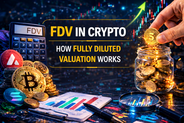
FDV in Crypto: How to Calculate It and Why It Exposes the Real Price You’re Paying
You Bought a $80M Market Cap Token. The Real Valuation Was $4 Billion.
The project looked modest. Market cap on CoinGecko — $80 million. For a new L1, that’s a reasonable entry point. You buy. Six months later the price is down 60% despite a working product and growing user base.
What happened? You missed the number sitting next to market cap: Fully Diluted Valuation — $4 billion. At the token’s current price, the entire project was valued at $4 billion — if you account for all tokens, not just the ones trading now. 95% of tokens hadn’t entered circulation yet. Every month new portions hit the market. Buyers couldn’t absorb the pressure. Price fell.
This isn’t an edge case. It’s the standard mechanics of most tokens launched after 2020. And FDV is the only metric that surfaces this problem before you’ve lost money.
Most retail investors look at market cap and price. A small minority look at FDV, the FDV/MC ratio, and what happens to that ratio over a 12–36 month horizon. This guide is about joining that minority.
What Is FDV in Crypto: The Definition That Actually Works
FDV — Fully Diluted Valuation — is the hypothetical market capitalization of a project assuming its entire maximum token supply is in circulation at the current price.
The formula:
FDV = Current Token Price × Max Supply
Or, if max supply is undefined:
FDV = Current Token Price × Total Supply
This is not the real market cap. It’s the potential valuation at full dilution. The gap between FDV and actual market cap represents tokens not yet on the market: locked in team and investor vesting contracts, sitting in the project treasury, scheduled for future release through staking rewards or ecosystem grants.
The Three Supply Numbers and What They Mean
Market Cap = Price × Circulating Supply. The real value of what’s actually trading right now.
Total Supply Market Cap = Price × Total Supply. The valuation of all existing tokens including locked ones.
FDV = Price × Max Supply. The valuation assuming every token that will ever exist is already in circulation.
Concrete example: a token trades at $2. Circulating supply — 50 million. Total supply — 400 million. Max supply — 1 billion.
- Market Cap = $100 million
- Total Supply MC = $800 million
- FDV = $2 billion
You paid $2 for that token. At that price, the real valuation of the project — accounting for all tokens — is $2 billion. Not the $100 million shown in CoinGecko’s first line.
How FDV Works: The Dilution Mechanics You Need to Understand
The Dilution Ratio: The Most Important Single Number
Dilution Ratio = FDV / Market Cap
When this ratio equals 1 — all max supply is in circulation, FDV equals market cap. Bitcoin’s ratio is currently about 1.07 — 93.8% of max supply has already been mined. Dilution is essentially complete.
When the ratio equals 20 — only 5% of tokens are trading, 95% are still coming. At current price, the project is “valued” at a level the market must sustain with 20x more supply. Either demand grows 20x, or price falls. The second outcome is overwhelmingly more common.
How FDV Changes Over Time
FDV isn’t static. It changes in two ways:
Price movement. If price rises, FDV rises proportionally. If price falls, FDV falls. This is a direct relationship — FDV is just price multiplied by a fixed number.
Max supply changes. For tokens without a hard cap — many proof-of-stake networks where staking rewards are theoretically unlimited — max supply is technically infinite. In these cases FDV is often calculated using total supply or projected supply on a 10-year horizon. Always check which methodology an aggregator uses.
Why FDV Matters More Than Market Cap at Token Launch
At listing, projects release a minimal percentage of total supply into circulation — often 5–15%. This is deliberate: limited supply against any demand creates upward price pressure. Market cap looks small. FDV reveals the real game: at what valuation are early investors and the team holding their locked tokens.
If a VC bought tokens at $0.10 in a private round and the listing price is $1.00 — they’re already sitting on 10x. FDV at listing includes their tokens in the valuation calculation. This means the market has already “agreed” to a valuation that bakes in their profit. The only question is when they’ll take it.
FDV depends on how much circulating supply in cryptocurrency is already available and how many tokens will enter the market.
Why FDV Matters: Three Things It Reveals That Market Cap Hides
1. The Real Project Valuation, Not the Marketing Valuation
Teams launch tokens with low circulating supply deliberately — to make market cap look modest. “Only $50M cap, room to grow” is a standard narrative. But if FDV is $5 billion, the project is already priced like a top-50 coin at current price. There’s no “room to grow” — there’s room to fall when the real supply arrives.
2. Future Selling Pressure Embedded in the Current Price
Every token sitting in vesting is a potential seller. An investor who bought at $0.05 with a current price of $1.00 holds a 20x gain. A team member whose tokens are fully earned has 100% profit on their allocation at any price above zero. When their vesting expires, the incentive to sell is enormous. FDV tells you how many of these potential sellers are waiting in line.
3. Whether the Current Valuation Makes Sense Against Real Competitors
FDV enables apples-to-apples comparisons. Two projects with identical market caps can have radically different FDVs — one nearly fully diluted, the other just beginning. Comparing by FDV gives the real picture of where each project sits in the valuation landscape relative to its full potential supply.
Where FDV Becomes Critical: Specific Scenarios That Matter
At Token Launch — When the Gap Is Widest
The first day of trading is the moment of maximum divergence between market cap and FDV. Projects exploit this deliberately: small float creates upward price pressure, screenshots of “multiples from listing price” spread across social media, retail buyers enter at the peak without checking FDV.
If you’re buying a token in its first days after listing, the first thing to check is the FDV/MC ratio. Anything above 10x at listing means 90%+ of tokens are still coming to market.
When Evaluating Investment Attractiveness
FDV is the right denominator for valuation multiples in crypto. If a protocol generates $50 million in annual revenue, market cap is $200 million, FDV is $2 billion — the real P/S ratio isn’t 4x. It’s 40x. That changes the investment conclusion entirely.
When Comparing Projects in the Same Category
You’re comparing two L2s. First: market cap $800M, FDV $900M — ratio 1.12x, 88% of supply in circulation. Second: market cap $600M, FDV $8B — ratio 13.3x, only 7.5% of supply in circulation. The second looks cheaper by market cap. By FDV it’s 8.9x more expensive. All else equal, the first is dramatically more attractive.
When Analyzing Upcoming Unlocks
FDV combined with an unlock calendar shows exactly what happens to the valuation on specific dates. If tokens equivalent to 30% of current circulating supply enter the market in six months — at constant demand, that’s theoretically a ~23% price decline from dilution alone. FDV is math, not speculation.
Risk Score for FDV Analysis: Formula Before You Buy
Before buying any token with elevated FDV, calculate its dilution risk.
Risk Score = (FDV_ratio × Unlock_speed) + (Insider_share × Time_to_unlock)
Each parameter rated 0 to 5:
- FDV_ratio — FDV/MC ratio (0 = equal, 5 = FDV >20x MC)
- Unlock_speed — % of circulating supply unlocking in next 6 months (0 = no unlocks, 5 = >50%)
- Insider_share — % of total supply held by team + investors (0 = <10%, 5 = >60%)
- Time_to_unlock — how close is the next major unlock (0 = >24 months away, 5 = <3 months away)
Score interpretation:
- 0–6: Low dilution risk — FDV is not the problem here
- 7–15: Moderate risk — watch unlock dates carefully
- 16–25: High risk — FDV creates structural selling pressure
- 26–50: Critical risk — buying means financing insider exits
Risk Score Examples
| Project | FDV_ratio | Unlock_speed | Insider_share | Time_to_unlock | Score | Verdict |
|---|---|---|---|---|---|---|
| Bitcoin | 0 | 0 | 0 | 0 | 0 | Benchmark |
| Ethereum | 0 | 0 | 0 | 0 | 0 | Fully diluted |
| Chainlink (LINK) | 2 | 1 | 2 | 2 | 9 | Moderate |
| Typical new L1 | 5 | 5 | 4 | 5 | 50 | Critical |
| Mature DeFi protocol | 1 | 1 | 1 | 3 | 6 | Low |
| New GameFi | 5 | 4 | 5 | 4 | 45 | Critical |
| L2 after year 1 | 3 | 3 | 3 | 3 | 24 | High |
Top Mistakes When Working With FDV
Mistake 1: Ignoring FDV Entirely and Watching Only Market Cap
The most common and expensive error. Market cap creates the illusion that a project is “small” with “room to grow.” FDV shows the real valuation accounting for all tokens. The difference can be 10–50x. A project with MC $100M and FDV $5B isn’t small — it’s priced like a large player, it’s just that most of its shares aren’t yet trading.
Mistake 2: Treating High FDV as Automatically Bad
FDV alone isn’t a verdict. High FDV combined with high revenue growth and genuine demand is normal for a young protocol. The problem isn’t the absolute FDV value — it’s the relationship between FDV and real fundamentals: revenue, active users, TVL. FDV $5B with $500M annual revenue (P/S 10x) is a completely different story than FDV $5B with $1M annual revenue (P/S 5,000x).
Mistake 3: Not Accounting for Dilution Speed
Even a high FDV/MC can be acceptable if dilution is spread over 10 years with small gradual unlocks. The same FDV/MC becomes a serious problem if 50% of remaining supply exits in the next 12 months. Dilution speed is a separate parameter that needs analysis alongside the absolute ratio.
Mistake 4: Confusing FDV With a “Target Market Cap”
“FDV of $10B means the project will be worth $10B when fully diluted” — this is a misreading. FDV $10B means that if price stays constant and all supply enters circulation, market cap would be $10B. Real future market cap depends on how price changes under the pressure of that dilution — likely downward. FDV is a current snapshot, not a forward projection.
Mistake 5: Not Checking FDV for “Established” Projects
Many investors only check FDV for new tokens. But projects launched 1–2 years ago often still have significant locked supply. Team vesting typically runs 3–4 years. An 18-month-old project can still carry FDV/MC of 3–5x — that’s a meaningful dilution risk that doesn’t disappear just because the project has history.
Investors compare FDV with market cap explained to evaluate potential overvaluation.
Mistake 6: Using FDV Without Accounting for Burn Mechanisms
If a project actively burns tokens — ETH burns with every transaction, BNB burns quarterly — max supply decreases and FDV changes. A static FDV calculation for deflationary tokens overstates the figure. Adjust for projected burn volume, especially for protocols where burn is substantial relative to supply.
How to Calculate and Analyze FDV: Step-by-Step Guide
This takes 20–30 minutes per project. Required before any purchase above $300.
Step 1 — Gather Baseline Data
Open CoinGecko or CoinMarketCap. Find the token. Record:
- Current price
- Circulating supply
- Total supply
- Max supply (if defined)
- Market Cap
- Fully Diluted Valuation (aggregators calculate automatically)
If max supply isn’t listed — use total supply for the FDV calculation, but note that this may understate real future dilution if the protocol has uncapped emission.
Step 2 — Calculate the Dilution Ratio
Dilution Ratio = FDV / Market Cap
- 1.0–1.5: Nearly fully diluted. Supply risk minimal.
- 1.5–3.0: Moderate dilution. Monitor unlocks.
- 3.0–10.0: Significant dilution. Detailed analysis required.
- 10.0+: Extreme dilution. Maximum caution warranted.
Step 3 — Find the Unlock Schedule
TokenUnlocks.app — enter the project name. Review:
- Nearest unlock dates and volumes
- Which categories unlock when (team, investors, ecosystem)
- Total unlock volume over the next 12 months as % of current circulating supply
Critical thresholds: >10% in 3 months is a red flag. >20% in 6 months is a serious problem.
Step 4 — Calculate Dilution Speed
Annual Dilution Rate = (Tokens entering circulation over next year / Current Circulating Supply) × 100%
If 200 million tokens enter circulation over the next 12 months against a current circulating supply of 500 million — annual dilution rate is 40%. At constant demand, price needs to fall approximately 29% just to absorb the dilution (1 / 1.4 = 0.714).
Step 5 — Compare FDV Against Fundamental Metrics
Open Token Terminal. Find the project. Check:
- Annualized Revenue
- Calculate P/S ratio = FDV / Annualized Revenue
P/S ratio benchmarks by FDV:
- Below 10x: Cheap relative to revenue
- 10–50x: Normal for a growing protocol
- 50–200x: Expensive, requires high growth to justify
- Above 200x: Extremely expensive, requires exceptional growth
Step 6 — Verify On-Chain Distribution
Etherscan → Token → Holders. Top 20 wallets. What % of supply is controlled by team and investors? Compare to declared documentation. If 60%+ of supply sits in locked wallets — that’s 60% of potential sellers at current price waiting for their vesting to complete.
Step 7 — Calculate Risk Score
Use the formula above. Record the result and its interpretation.
FDV Analysis Checklist
- ✅ FDV and Market Cap recorded from aggregator
- ✅ Dilution ratio calculated (FDV/MC)
- ✅ Unlock schedule reviewed on TokenUnlocks.app
- ✅ Annual dilution speed calculated
- ✅ P/S ratio by FDV calculated via Token Terminal
- ✅ On-chain distribution verified on Etherscan
- ✅ Insider share of total supply identified
- ✅ Risk Score calculated and below 15
- ✅ FDV compared against category peers
Real Cases: How FDV Predicted What the Market Was Ignoring
Case 1: Aptos (APT) — $14 Billion FDV at Launch With Near-Zero Revenue
October 2022. Aptos lists on Binance. Day-one price around $8. Circulating supply at launch — approximately 130 million APT out of 1 billion total supply. Market cap at listing — roughly $1 billion. Sounds like a mid-sized project.
FDV at $8 with total supply of 1 billion — $8 billion. At peak price of $19.92 in January 2023 — FDV exceeded $14 billion. At that point, the network had a few thousand daily active users. Revenue was effectively zero.
For context: Ethereum with a $140B market cap at the same time had thousands of applications, millions of users, and hundreds of millions in annual fees. Aptos with a $14B FDV had a working testnet and a roadmap.
What followed: APT declined steadily as team and investor vesting unlocks began entering the market. By end of 2023, APT traded in the $5–7 range — well below the launch hysteria. Those who bought at $15–20 based on “small market cap” without checking FDV lost 65%+. The product wasn’t the problem. The valuation was.
Case 2: ImmutableX (IMX) — FDV/MC of 8x During the NFT Boom
November 2021. NFT mania at its peak. IMX lists. Price $3.50. Circulating supply — 250 million out of 2 billion total supply. Market cap — $875 million. FDV — $7 billion. Dilution ratio — 8x.
The narrative was strong: an L2 purpose-built for NFTs at the exact moment NFTs were the hottest thing in crypto. Many buyers entered based on the “modest” $875M market cap. The $7B FDV went largely unexamined.
From November 2021 to December 2022, IMX fell from $3.50 to $0.35 — a 90% decline. Partly this was a bear market. Partly it was systematic dilution through ecosystem grants and vesting unlocks hitting a shrinking buyer base. Anyone who checked the FDV understood that $7B required NFT platform fees of hundreds of millions annually to justify the valuation. That didn’t materialize.
Token economics is also influenced by network usage and gas fees in crypto.
Case 3: Optimism (OP) — FDV $5.6B at Launch With Transparent Dilution
May 2022. Optimism launches the OP token. Launch price ~$1.30. Circulating supply — 214 million out of 4.29 billion total supply (4.99% in circulation). Market cap — $278 million. FDV — $5.6 billion. Dilution ratio — approximately 20x.
By any standard, an extreme FDV/MC. But Optimism handled it correctly: a fully transparent unlock schedule published in advance, tokens distributed through governance grants with genuine community voting, Retroactive Public Goods Funding creating organic community formation around the process.
By 2024, OP traded in the $1.50–$3.50 range — above the launch price despite significant dilution. Reason: Optimism network activity and Superchain growth, real revenue from sequencer fees, transparent token governance. High FDV isn’t always catastrophic — if the project genuinely grows faster than dilution. But projects that do this are the minority, not the default.
Case 4: Uniswap (UNI) — How FDV Tracked a Protocol’s Maturation
September 2020. UNI airdrop. Price ~$3. Total supply 1 billion, with 15% distributed immediately via the airdrop. FDV at $3 — $3 billion. Market cap from distributed tokens — approximately $450 million. Ratio — roughly 6.7x.
By May 2021, UNI peaked at $44. FDV — $44 billion. Market cap — around $25 billion (more tokens had vested and entered circulation). FDV/MC ratio had compressed to ~1.75x — most supply was now circulating.
This is the normal trajectory of a healthy project: FDV/MC compresses over time as dilution occurs, while product growth and demand absorb the incoming supply. Uniswap was one of the rare cases where revenue growth ($1B+ in protocol fees during 2021) genuinely justified the elevated FDV-based valuation. The protocol earned its multiple. Most don’t.
Comparing Projects by FDV: How to Read the Numbers Right
| Project | Market Cap | FDV | Dilution Ratio | % Supply Circulating | Annual Revenue* | P/S by FDV |
|---|---|---|---|---|---|---|
| Bitcoin (BTC) | $1.3T | $1.4T | 1.07x | 93.8% | N/A | N/A |
| Ethereum (ETH) | $430B | $430B | 1.0x | ~100% | $2B+ | ~215x |
| Uniswap (UNI) | $7B | $8B | 1.14x | 87.5% | $500M+ | ~16x |
| Chainlink (LINK) | $11B | $19B | 1.72x | 58.7% | $100M+ | ~190x |
| Optimism (OP) | $3B | $15B | 5x | 20% | $150M+ | ~100x |
| Typical new L1 | $200M | $4B | 20x | 5% | <$1M | >4,000x |
| Mature DeFi | $500M | $600M | 1.2x | 83% | $50M+ | ~12x |
*Approximate figures for illustrative purposes. Verify current data on Token Terminal before making decisions.
How to read this table: focus on P/S by FDV. This is the real price you’re paying for revenue, accounting for all supply. A new L1 with P/S of 4,000x needs extraordinary revenue growth to justify its valuation. A mature DeFi protocol at P/S 12x by FDV is a more tractable story. The gap between these figures is not a rounding error — it’s the difference between rational and speculative pricing.
How Scammers Use FDV Against You
Hiding FDV Behind a “Modest Market Cap”
Standard launch playbook: 3–5% of tokens on day one. The rest with team and VCs. Market cap $20–50M — “modest launch, room to grow.” FDV $1–2B — the actual valuation the creators believe is fair at current price. Marketing is built around market cap. FDV is buried, mentioned in footnotes, or requires manual calculation to find.
Defense: always calculate FDV/MC yourself. If the aggregator doesn’t display it clearly — take the price, multiply by max supply. If max supply is undefined — use total supply and note the limitation.
“Only 10% Is Out There — Means 10x Potential”
The logic being sold: “only 10% of supply is in circulation, when it reaches 100% the cap will grow 10x, meaning price will grow 10x.” This is mathematically wrong. When supply grows 10x at constant demand, price falls approximately 10x and market cap stays roughly the same. Price growth requires demand to grow faster than supply. The “low float equals multiple potential” narrative is an inversion of the actual mechanics.
FDV of the “Future” vs FDV of the Present
Some teams publish “valuations” based on future metrics: “our TAM is $50 billion, we’ll capture 5% = $2.5B cap, at our FDV that’s 4x upside.” This is not FDV. It’s projected wishful thinking. FDV is calculated only from current price. Any “adjusted FDV” or “target FDV” is marketing dressed as analysis.
Burn Announcements to Create Artificial Scarcity
“We burned 10% of supply — FDV dropped 10%!” If simultaneously a team vesting unlock is occurring or staking rewards are being emitted — net supply pressure hasn’t decreased. Always check: (tokens burned) minus (tokens newly emitted) equals the real change. Headline burns without accounting for simultaneous emission are a numerical sleight of hand.
Retroactive Max Supply Changes
Less common but real: projects change max supply parameters through governance after price has formed. An “emergency” proposal to emit additional tokens for “ecosystem needs.” FDV instantly expands, real valuation per token drops. Monitor governance proposals — especially any that touch supply parameters. These are the governance votes that matter most for token economics.
Who Is at Risk: Investor Profiles That FDV Consistently Traps
| Profile | Core Vulnerability | Typical Loss Scenario |
|---|---|---|
| Listing-day buyers | Focus on market cap, not FDV | Enter on day one, sell a year later at a loss |
| Market cap comparers | Compare projects by MC without FDV | Think “cheap L1” is cheaper than Bitcoin when FDV is comparable |
| FOMO multiple hunters | Believe “low float equals multiples” | Buy at 10x FDV/MC, receive dilution instead |
| Long-term holders without monitoring | Bought and forgot, don’t track unlocks | Learn about dilution after price has already fallen 50% |
| VC portfolio copiers | Enter at retail price what funds bought at 0.01x | Fund exits at first unlock, retail holds a declining asset |
| DeFi yield farmers | Focus on APY, ignore FDV of reward tokens | Farm tokens with FDV/MC of 30x, earn negative real returns |
When FDV Analysis Does NOT Work: Honest Limitations
FDV is a powerful tool but not a universal one:
- Meme coins. DOGE has no max supply — FDV is technically infinite. Price is driven by social dynamics and narrative. Applying FDV analysis to meme coins is meaningless — it predicts nothing useful.
- Fully diluted tokens. If FDV/MC equals 1.0–1.1 — all supply is in circulation, dilution analysis is irrelevant. For Bitcoin, Ethereum, and similarly mature assets — look at other factors.
- Tokens with dynamic supply. Algorithmic stablecoins, rebasing tokens, and protocols with automated supply management — FDV in the standard sense doesn’t apply. Supply changes algorithmically, not on a vesting schedule.
- Short-term trading. On a 1–30 day horizon, FDV barely moves price. Narrative, liquidity, and technical analysis dominate. FDV is a 6–36 month metric. Using it for short-term trades adds noise without signal.
- Projects in early exponential growth. Occasionally, revenue and user growth so dramatically outpaces dilution that a high FDV/MC is genuinely justified. Uniswap 2020–2021, Solana 2020–2021 are examples where fundamental growth overwhelmed supply pressure. These cases exist — they’re just the minority, not the default assumption to make.
Myths About FDV
| Myth | Reality |
|---|---|
| “FDV is the project’s target market cap” | FDV = current price × max supply. Not a target, not a forecast |
| “High FDV/MC always means avoid” | For growing protocols with genuine revenue, it can be acceptable with transparent vesting |
| “FDV doesn’t matter for established projects” | If a mature project still has significant locked supply, FDV risk remains |
| “The project will disclose the real FDV” | Teams highlight market cap. FDV often requires manual calculation |
| “Burning tokens reduces FDV” | Only if max supply is explicitly reduced. Otherwise FDV is unchanged |
| “VC backing reduces FDV risk” | VC presence means large locked allocations with strong selling incentives at unlock |
| “Low FDV means undervalued” | Low FDV can mean the project is fully diluted and trading fairly, not that it’s cheap |
| “Aggregators always calculate FDV correctly” | CoinGecko and CMC sometimes use total supply instead of max supply. Check their methodology |
Frequently Asked Questions (FAQ)
What is FDV in crypto in simple terms?
Fully Diluted Valuation — the project’s valuation at current price assuming all tokens are in circulation. Formula: FDV = price × max supply. This number shows how expensive the project really is when you account for all the tokens still locked with the team, investors, and treasury — not just the ones trading today.
What’s the difference between FDV and market cap?
Market cap = price × circulating supply (what’s trading right now). FDV = price × max supply (everything that will ever trade). The gap between them is locked tokens in vesting, treasury, and scheduled releases. For a new project this gap can be 10–20x.
What FDV/MC ratio is reasonable?
Benchmarks: below 2x — low risk, 80%+ of supply already circulating. 2–5x — moderate, watch unlocks. 5–10x — high, detailed analysis required. Above 10x — extreme, requires exceptionally strong arguments to justify buying right now.
How do I calculate FDV myself?
Take the current token price. Find max supply in the official documentation or on CoinGecko. Multiply them. If max supply isn’t defined — use total supply. Compare the result to market cap. Divide FDV by market cap — that’s the dilution ratio. This takes under two minutes.
Where do I find FDV and unlock schedule data?
FDV: CoinGecko and CoinMarketCap display it automatically on the token page. Verify which supply figure they use for the calculation — methodology matters. Unlock schedule: TokenUnlocks.app is the best specialized tool. Messari.io provides structured vesting data with project profiles.
Why do projects launch with high FDV/MC?
Deliberate strategy. Low circulating supply at launch creates upward price pressure — generating screenshots of “multiples from listing price” that spread organically. Early investors and team want a high listing price because it determines their locked token profits. High FDV at launch is often a signal that insiders are optimizing their own exit, not long-term value for public buyers.
Does FDV affect price in the short term?
Directly — no. Over days or weeks, price is driven by narrative, trading volume, and technical analysis. FDV starts affecting price over 3–12 months when real unlocks create actual selling pressure. This makes FDV analysis relevant for medium and long-term positions, not short-term trades.
How is FDV used to compare projects?
FDV enables true apples-to-apples comparison: two projects with identical market caps can have FDVs that differ 5–10x due to different supply structures. All else equal, the project with lower FDV and lower dilution ratio is structurally more attractive. FDV is also used for real valuation multiples: P/S = FDV / Annual Revenue gives you a honest measure of how expensive a protocol actually is.
What if a project has no max supply?
Use total supply for the calculation. Note that for tokens without a hard cap, FDV grows as new tokens are emitted — which is an additional dilution risk. For such projects, analyzing the annual emission rate and its impact on real valuation becomes especially important alongside the static FDV number.
Can FDV change without price changing?
Yes. If a project issues additional tokens through a governance vote — expanding total or max supply — FDV increases even if price is unchanged. If a project burns tokens and reduces max supply, FDV decreases at constant price. This is why monitoring governance proposals that touch supply parameters is part of ongoing FDV analysis, not just a one-time check at purchase.
Conclusion: Three Rules, One Principle, One Hard Criterion
Rule 1. Always calculate FDV/MC before buying. It takes two minutes. If the ratio exceeds 5x, you’re paying for tokens that don’t yet exist in circulation — at a price that doesn’t account for their future arrival. That’s a conscious risk only if you have a specific reason to believe demand will outpace supply. Without that reason, it’s an assumption you haven’t examined.
Rule 2. Use P/S by FDV, not by market cap. A project with market cap $200M and revenue $50M looks cheap at P/S 4x. The same project with FDV $4B carries P/S 80x by FDV — expensive. The correct denominator for valuation multiples is FDV. Market cap is a temporary snapshot of a diluting supply structure. FDV is the honest number.
Rule 3. Check the unlock schedule for the next 12 months after calculating FDV/MC. High dilution ratio spread over 7 years is a different risk than the same ratio with 50% unlocking in the next six months. Dilution speed matters as much as dilution scale. Both need to be in the picture.
The principle: FDV is the honest price. Market cap is the marketing price. Teams know their FDV. They know the valuation at which they’re holding their locked tokens. When they say “small market cap” — they mean the market cap. When they sell — they sell from the FDV.
The hard criterion: if you cannot explain why demand for this token will grow faster than supply over the FDV dilution horizon — you’re not investing. You’re paying a premium today for something that will be cheaper tomorrow when the rest of the supply arrives.
Read more:
Circulating Supply in Cryptocurrency — how circulating supply affects token price and valuation.
What Is Crypto Market Capitalization — why market cap matters more than token price.
Gas Fees in Crypto Explained — why blockchain transactions require network fees.
Ethereum, BSC and Solana Networks Guide — understanding different blockchain networks.
Can a Crypto Wallet Address Be Hacked — how crypto wallet addresses work and their security.
The Number Everyone Sees and Almost Nobody Uses Correctly
You open a stock screener. Apple — $3 trillion. Some biotech you’ve never heard of — $340 million. Your instinct says Apple is “safer” and the biotech is “speculative.” That instinct is roughly correct — but not because of the numbers themselves. Because of what those numbers represent when you actually understand them.
Most investors treat market cap as a price tag. The bigger the number, the more expensive or established the company. The smaller, the cheaper or riskier. This framing creates real problems. A $500 million company isn’t necessarily cheaper than a $50 billion one — it might just have fewer shares outstanding. A $3 trillion market cap doesn’t mean a company is safe — it means millions of investors currently agree on that valuation, which is a very different thing.
Market cap is one of the most cited numbers in investing. It’s also one of the most frequently misapplied. Understanding what market cap actually measures — and what it deliberately ignores — is the difference between using it as a tool and being misled by it as a shortcut.
This guide covers market capitalization from first principles: the formula, what it reveals, what it hides, how it applies to stocks versus crypto, what the Buffett Indicator tells you, and why the “small cap stocks explained” question matters far beyond just categorizing companies by size.
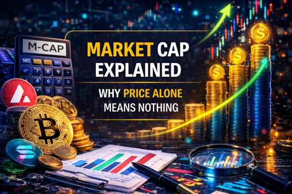
What Is Market Cap: Market Cap Explanation That Actually Sticks
Market capitalization is the total market value of a company’s outstanding shares. It answers one specific question: if you bought every single share at today’s price, how much would you pay?
The formula:
Market Cap = Current Share Price × Total Shares Outstanding
That’s the complete calculation. Nothing else enters it. Not debt. Not cash. Not earnings. Not future growth. Just price times shares.
This simplicity is both market cap’s greatest strength and its central limitation. It’s instantly calculable, universally comparable, and updates in real time. It also tells you nothing about whether a company is profitable, how much it owes, or what it’s actually worth relative to its assets.
Market Cap Simple Explanation: The Apartment Building Analogy
Imagine an apartment building split into 1 million identical units. Today, the last unit sold for $500. Market cap of the entire building: $500 million. Does that mean the building is worth $500 million? Only in the sense that the marginal buyer — the person who bought the last unit — agreed to pay $500 for their piece. Whether the building has structural problems, outstanding mortgage debt, or tenants who haven’t paid rent in six months — none of that changes the market cap calculation.
This is exactly how stock market cap works. Price reflects what the last transaction agreed on. The full picture requires more.
Three Numbers That Work Together
Market Cap — price × shares outstanding. What the market says the equity is worth right now.
Enterprise Value (EV) — Market Cap + Total Debt − Cash. What it would actually cost to buy the whole business, including its obligations. This is the number serious acquirers use.
Book Value — total assets minus total liabilities. What the company would theoretically be worth if it liquidated everything today.
Market cap alone is the first number. Enterprise Value and Book Value give context. Used together they tell a far more complete story.
How Market Cap Works: The Mechanics Behind the Number
How Share Price and Shares Outstanding Interact
Two companies, same market cap, completely different stories:
Company A: 10 million shares at $100 each → Market cap $1 billion Company B: 1 billion shares at $1 each → Market cap $1 billion
Same size by market cap. Completely different share structures. A company trading at $1 per share is not “cheaper” than one at $100 per share — the per-share price means nothing in isolation.
This seems obvious when stated directly. In practice, retail investors buy shares priced at $5 thinking they’re getting a bargain compared to shares at $500. Share price without context of shares outstanding is useless information.
Token price alone does not reflect value — you need to understand circulating supply in cryptocurrency.
How Market Cap Changes Over Time
Market cap changes continuously during trading hours because price changes continuously. But shares outstanding also changes — more slowly — through several mechanisms:
New share issuance. Companies raise capital by issuing new shares. This dilutes existing shareholders and increases shares outstanding, which can increase market cap even if price per share stays flat.
Share buybacks. Companies repurchase their own shares, reducing shares outstanding. With fewer shares in existence, earnings per share rises — which often pushes share price up. Market cap may stay roughly constant while EPS improves.
Stock splits. A 2-for-1 split doubles shares outstanding and halves price per share. Market cap stays identical. The split changes nothing fundamental — just the number on the ticker.
Reverse stock splits. Halves shares, doubles price. Still the same market cap. Usually done by companies trying to avoid delisting due to low share price.
Market Cap in Crypto: Important Differences From Stocks
In traditional stocks, “shares outstanding” is a relatively stable, legally defined number. In crypto, circulating supply — the equivalent of shares outstanding — is dynamic, sometimes manipulable, and calculated differently by different aggregators.
For crypto: Market Cap = Current Price × Circulating Supply
And separately: Fully Diluted Valuation (FDV) = Current Price × Max Supply
The gap between crypto market cap and FDV can be enormous — 10x, 20x, sometimes more. This gap doesn’t exist in the same way for established stocks, which is why crypto investors need to understand both numbers while stock investors typically only need one. For a full treatment of FDV in crypto, see the dedicated guide linked below.
Why Market Cap Matters: What It Actually Tells You
It Sets Risk and Return Expectations Correctly
The market cap categories — large cap, mid cap, small cap, micro cap — are not arbitrary. They reflect real differences in liquidity, volatility, analyst coverage, institutional ownership, and historical risk/return profiles.
A large cap company has thousands of analysts covering it, institutional investors reviewing every quarterly filing, and enough trading volume that it takes a major event to move the price significantly. A micro cap company might have zero analyst coverage, trade by appointment, and move 30% on a single news release. Same asset class, entirely different dynamics.
It Enables Apples-to-Apples Comparison
Comparing share prices between companies means nothing. Comparing market caps compares the total market-assigned value of the equity. A $20 billion company in the semiconductor space versus a $50 billion company in the same space — now you have a basis for comparison using valuation multiples: P/E by market cap, P/S, P/B, and so on.
It’s the Foundation for Valuation Multiples
Every ratio-based valuation metric starts from market cap or its components:
P/E Ratio = Market Cap / Net Income (or Price / EPS) P/S Ratio = Market Cap / Annual Revenue P/B Ratio = Market Cap / Book Value EV/EBITDA = Enterprise Value / EBITDA
Without market cap you can’t calculate these. Without these you can’t answer whether a company is cheap or expensive relative to its fundamentals.
The Buffett Indicator Explained: Market Cap at the Macro Level
The Buffett Indicator is one of Warren Buffett’s most cited macro valuation tools. It takes market cap to its logical extension: if market cap of one company tells you what the market thinks that company is worth, then total market cap of all public companies tells you what the market thinks the entire economy is worth.
Buffett Indicator = Total Stock Market Cap / GDP
Buffett described it as “probably the best single measure of where valuations stand at any given moment.” When total market cap significantly exceeds GDP, the market is pricing in future growth that must materialize to justify current valuations.
Buffett Indicator Explained With Historical Context
Below 75%: Market is undervalued relative to economic output. Historically a buying signal. 75–90%: Roughly fairly valued. Normal range in many historical periods. 90–115%: Moderately overvalued. Caution warranted. Above 115%: Significantly overvalued. Buffett himself has cited this level as a warning sign.
The US market exceeded 200% of GDP during the 2021 bull market — a level never seen before in the indicator’s history. This doesn’t mean an immediate crash is imminent — markets can remain overvalued by this measure for years. But it establishes the context: investors are paying a multiple of annual economic output for the right to own pieces of companies within that economy.
Limitations of the Buffett Indicator
The indicator has critics. In a low-interest-rate environment, higher P/E and higher total market cap relative to GDP may be structurally justified — money flows from bonds into equities when bond yields are near zero. International revenue also inflates US market cap relative to domestic GDP. The indicator is a macro signal, not a precise timing tool.
Market Cap Categories: Small Cap Stocks Explained and the Full Spectrum
The Standard Categories and What They Mean in Practice
| Category | Market Cap Range | Characteristics |
|---|---|---|
| Mega Cap | >$200 billion | Apple, Microsoft, Saudi Aramco. Maximum liquidity, global brand recognition, institutional ownership |
| Large Cap | $10B–$200B | S&P 500 core. Strong analyst coverage, established business models, moderate volatility |
| Mid Cap | $2B–$10B | Often growth companies in transition. More volatile than large cap, more liquid than small cap |
| Small Cap | $300M–$2B | Small cap stocks explained: limited analyst coverage, higher volatility, potential for higher returns |
| Micro Cap | $50M–$300M | Minimal coverage, thin liquidity, high risk. Institutional investors largely absent |
| Nano Cap | Below $50M | Effectively speculative. Easily manipulated, minimal regulatory scrutiny in practice |
Small Cap Stocks Explained: Why This Category Matters for Returns
The small cap premium — the historical tendency of small cap stocks to outperform large cap over long periods — is one of the most studied phenomena in finance. The original Fama-French research documented it. Subsequent research has debated its persistence.
The practical explanation: small cap companies are underfollowed. Less analyst coverage means more pricing inefficiency. More pricing inefficiency means more opportunity for investors who do their own research to find mispriced assets. Large cap companies have thousands of analysts running nearly identical models — the chance of finding something the market doesn’t know is minimal.
The flip side: small cap stocks carry real risks that the premium compensates for. Lower liquidity means larger bid-ask spreads and more price impact when selling. Higher volatility means larger drawdowns. Less institutional ownership means less price support during market stress. The small cap premium isn’t free money — it’s compensation for accepting these specific risks.
The Russell 2000 vs S&P 500: A Concrete Comparison
The Russell 2000 tracks roughly 2,000 small cap US stocks. The S&P 500 tracks 500 large cap stocks. Historical comparison over 20-year periods shows the Russell 2000 outperforming during economic recovery phases and underperforming during risk-off environments. In 2020–2021, the Russell 2000 significantly outperformed as economic recovery drove small cap enthusiasm. In 2022, it underperformed as rising rates hit growth-dependent smaller companies harder than large cap defensive names.
Where and When Market Cap Analysis Becomes Critical
At the Portfolio Construction Stage
Asset allocation by market cap category is a fundamental portfolio decision. A portfolio concentrated entirely in mega caps has very different characteristics — lower expected volatility, lower expected long-term return, higher liquidity — than one with significant small cap exposure. Index funds often weight by market cap automatically, meaning investors in market-cap-weighted indices naturally hold proportionally more of the largest companies.
During Market Cycle Transitions
Different market cap categories behave differently across economic cycles. Early economic expansion: small caps tend to lead, as smaller companies benefit disproportionately from improving credit conditions and consumer spending. Late cycle and recession: large caps tend to outperform, with more stable cash flows, stronger balance sheets, and the ability to weather revenue declines better than smaller competitors.
When Evaluating M&A Targets and Acquirers
In mergers and acquisitions, market cap determines relative transaction size and premium paid. When a $200B company acquires a $5B company — a 4% acquisition relative to acquirer’s size — the market barely notices. When a $10B company announces a $4B acquisition — 40% of its own size — investors scrutinize execution risk much more carefully.
In Crypto: When Circulating Supply Creates Artificial Market Cap
In cryptocurrency markets, market cap can be directly manipulated through supply engineering. Low circulating supply at launch creates a small reported market cap that makes a project look modestly sized. FDV — the real valuation — is often 10–20x larger. Understanding this gap is critical and covered in depth in the Circulating Supply and FDV guides.
Risk Score: How to Evaluate Market Cap in Investment Context
A practical scoring system for evaluating market cap risk in any investment decision.
Risk Score = (Valuation_multiple × Dilution_risk) + (Liquidity_risk × Concentration_risk)
Each parameter rated 0 to 5:
- Valuation_multiple — how stretched are valuation multiples relative to sector (0 = below average, 5 = >5x sector average)
- Dilution_risk — how much share issuance is expected (0 = buybacks in progress, 5 = significant new issuance planned)
- Liquidity_risk — market cap category (0 = mega cap, 5 = nano cap)
- Concentration_risk — ownership concentration (0 = broad institutional ownership, 5 = >50% held by one entity)
Score interpretation:
- 0–6: Low risk — market cap dynamics are manageable
- 7–15: Moderate risk — specific factors need monitoring
- 16–25: High risk — market cap category creates meaningful structural risk
- 26–50: Critical risk — market cap dynamics dominate the risk profile
Example Scores Across Asset Types
| Asset | Valuation_multiple | Dilution_risk | Liquidity_risk | Concentration_risk | Score | Verdict |
|---|---|---|---|---|---|---|
| Apple (AAPL) | 1 | 0 | 0 | 1 | 1 | Very low risk |
| S&P 500 Index | 2 | 0 | 0 | 1 | 2 | Low risk |
| Quality small cap | 2 | 1 | 2 | 2 | 9 | Moderate |
| Speculative small cap | 3 | 3 | 3 | 3 | 18 | High |
| Micro cap growth | 4 | 4 | 4 | 3 | 28 | Critical |
| New crypto (low float) | 3 | 5 | 4 | 5 | 32 | Critical |
Top Mistakes When Using Market Cap
Mistake 1: Treating Low Market Cap as “Cheap”
A $50M market cap company is not inherently cheap. It’s small. Cheap means undervalued relative to intrinsic value — which requires knowing earnings, assets, cash flow, and growth prospects. A $50M company burning $20M per year with no path to profitability is expensive. A $50M company with $30M in annual earnings is extraordinarily cheap. Market cap alone tells you neither story.
Mistake 2: Confusing Market Cap With Company Value or Price to Buy the Business
Market cap is the value of the equity. It does not include debt. A company with $5B market cap and $8B in debt costs the acquirer $13B to purchase cleanly — not $5B. Enterprise Value = Market Cap + Debt − Cash is the right measure for acquisition analysis. Retail investors who look only at market cap when evaluating “cheap” companies miss the debt structure entirely.
Network usage and demand are also influenced by gas fees in crypto.
Mistake 3: Comparing Market Caps Across Different Sectors Without Adjustment
A $30B biotech trades at very different multiples than a $30B utility. Same market cap, radically different valuation frameworks. Biotech may have zero current revenue and be valued entirely on pipeline probability. Utilities trade on dividend yield and regulated asset base. Cross-sector market cap comparison is noise unless adjusted for sector-appropriate multiples.
Mistake 4: Ignoring Float in Market Cap Calculations
Float — shares actually available for public trading — is often significantly smaller than total shares outstanding for companies with large insider ownership or restricted share programs. A company with 500M shares outstanding but 350M held by the founder has a float of 150M shares. Price volatility and liquidity dynamics are determined by the float, not total shares. Market cap calculated on total shares can overstate effective market size.
Mistake 5: Using Market Cap to Predict Short-Term Price Movement
Market cap categorization predicts statistical tendencies over long periods. It doesn’t predict next week’s price. Small caps are more volatile — but whether a specific small cap goes up or down next month depends on factors entirely unrelated to its size category. Using “it’s a small cap so it might move more” as a trading thesis is underdetermined.
How to Use Market Cap: Step-by-Step Guide for Stocks and Crypto
Step 1 — Find the Market Cap
For stocks: Yahoo Finance, Bloomberg, or any major screener shows market cap on the company overview page. Confirm which share count is used — basic shares outstanding or fully diluted (including options and warrants).
For crypto: CoinGecko or CoinMarketCap. Note both Market Cap and Fully Diluted Valuation. Calculate the ratio. Anything above 3x warrants investigation of the vesting schedule.
Step 2 — Identify the Category
Apply the category framework from the table above. Note what that category implies for liquidity, volatility, and institutional coverage. Adjust your position sizing accordingly — smaller caps typically warrant smaller positions given higher volatility.
Step 3 — Calculate Key Valuation Multiples
For stocks:
- P/E = Market Cap / Net Income
- P/S = Market Cap / Annual Revenue
- P/B = Market Cap / Book Value
For crypto:
- P/S by FDV = FDV / Annualized Protocol Revenue (from Token Terminal)
- Market Cap / TVL ratio (for DeFi protocols)
Step 4 — Compare Against Sector Peers
Valuation multiples only make sense relative to peers. Find 3–5 comparable companies in the same sector and stage. Is this company trading at a premium or discount to peers? Is the premium/discount justified by superior/inferior fundamentals?
Step 5 — Apply the Buffett Indicator for Macro Context
Check the current Buffett Indicator level (Total Market Cap / GDP). This provides macro context: are you investing in a broadly overvalued market or an undervalued one? Individual stock analysis doesn’t override macro context — it’s one more input.
Step 6 — Calculate Risk Score
Use the formula above. Score above 15 warrants additional scrutiny regardless of how attractive the individual story looks.
Market Cap Analysis Checklist
- ✅ Market cap and shares outstanding recorded
- ✅ Float identified and noted if significantly smaller than total shares
- ✅ Market cap category identified (mega/large/mid/small/micro)
- ✅ P/E, P/S, P/B calculated and compared to sector peers
- ✅ For crypto: FDV/MC ratio calculated and unlock schedule reviewed
- ✅ Enterprise Value calculated (market cap + debt − cash)
- ✅ Buffett Indicator context noted
- ✅ Risk Score calculated and below 15
- ✅ Position size adjusted for market cap category
Real Cases: How Market Cap Analysis Reveals What Prices Hide
Case 1: Apple’s Market Cap Journey — From Near-Bankruptcy to $3 Trillion
In 1997, Apple’s market cap was approximately $3 billion. Steve Jobs had just returned. The company was weeks from insolvency. By 2023, Apple crossed $3 trillion — a 1,000x increase. The market cap at each point reflected market consensus about future cash flows. In 1997 the consensus was wrong about survival. In 2023 it bakes in extraordinary future expectations.
The lesson: market cap reflects current consensus, not intrinsic truth. The consensus can be spectacularly wrong in both directions. At $3B in 1997, Apple was undervalued by nearly any measure. At $3T in 2023, the question is whether those future cash flows — enormous as they are — justify the valuation. Neither answer is obvious from the market cap number alone.
Case 2: WeWork — $47 Billion Market Cap, Zero Earnings, Terminal Decline
WeWork’s private valuation peaked at $47 billion in early 2019. This was a private market cap — not publicly traded, but structured as if it were. The business: lease long-term office space, sublease it short-term. Revenue was real. Losses were enormous and growing. Cash burn was catastrophic.
When WeWork attempted its IPO in 2019, public market investors applied the same scrutiny they’d apply to any other company. The prospectus revealed a business model that couldn’t survive a recession — fixed long-term lease obligations against flexible short-term revenue. The IPO was pulled. The company eventually went public at a fraction of the $47B valuation.
The WeWork case is the clearest modern example of market cap — even private market cap — as a consensus number that can be wildly disconnected from underlying value. The $47B reflected a few large investors’ agreement, not market-wide price discovery.
Case 3: GameStop — Small Cap Mechanics Amplified
January 2021. GameStop (GME) was a small cap stock — brick-and-mortar gaming retail, $1.3B market cap, heavily shorted. Short interest exceeded 140% of float. A Reddit community (WallStreetBets) coordinated buying, creating a short squeeze. Within days, GME market cap exceeded $24 billion — a 1,745% increase — before crashing back.
The small cap mechanics that made this possible: thin float (most shares owned by insiders, not trading freely), high short interest (forced covering added buying pressure), low institutional ownership (few large stabilizing sellers). A mega cap with broad institutional ownership can’t be squeezed this way — the float is simply too large and too diversely held.
The GME episode showed exactly what small cap stocks explained means in practice: illiquidity, volatility, and reflexive price dynamics that have nothing to do with the underlying business.
Case 4: Berkshire Hathaway’s Market Cap vs Book Value — The Buffett Indicator at Company Level
Berkshire Hathaway trades at roughly 1.4–1.6x book value historically. Warren Buffett has said he considers buybacks when Berkshire trades below 1.2x book — implying the market is undervaluing the company’s assets. When it trades above 1.6x, he becomes more cautious.
This is the company-level equivalent of the Buffett Indicator: comparing market cap to an underlying measure of value (book value) to determine whether the market is overvaluing or undervaluing. Buffett applies to his own company the same framework he applies to the broader market.
Comparison: Market Cap Categories and Their Investment Profiles
| Category | Market Cap | Typical Volatility | Analyst Coverage | Institutional Ownership | Liquidity | Historical Return Profile |
|---|---|---|---|---|---|---|
| Mega Cap | >$200B | Low | Extensive | Very high | Very high | Lower but stable |
| Large Cap | $10B–$200B | Low-Moderate | High | High | High | Moderate, consistent |
| Mid Cap | $2B–$10B | Moderate | Medium | Moderate | Moderate | Higher potential, more variance |
| Small Cap | $300M–$2B | High | Limited | Low-Moderate | Moderate-Low | High potential, significant variance |
| Micro Cap | $50M–$300M | Very high | Minimal | Very low | Low | Speculative, variable |
| Nano Cap | <$50M | Extreme | Near zero | Negligible | Very low | Primarily speculative |
How Scammers Use Market Cap Against You
The “Small Cap, Big Upside” False Promise
“This company has a $30M market cap. If it reaches Apple’s size, that’s a 100,000x return.” This is presented as if market cap size is the only variable separating this company from Apple. It isn’t. Apple has $400B+ in annual revenue, $100B+ in annual profit, billions of loyal customers, and decades of execution history. The $30M company has none of these. Market cap compression doesn’t create upside — business performance does. Scammers reverse-engineer this, pointing to a small market cap as if it were evidence of undervaluation.
Pump and Dump Through Market Cap Manipulation
Micro cap and nano cap stocks are the natural habitat of pump-and-dump schemes precisely because of their market cap characteristics: thin float, minimal analyst coverage, no institutional ownership to provide price stability. A coordinated buying campaign can move a $20M market cap stock 500% in days. Once retail investors are attracted by the price movement, original holders distribute. Market cap inflates artificially then collapses.
Crypto: Low Market Cap as a Proxy for “Early Opportunity”
New crypto projects launch with low circulating supply creating artificially low market cap. Marketing frames this as “getting in early like Bitcoin in 2013.” The comparison ignores that Bitcoin in 2013 also had a near-1.0 FDV/MC ratio — essentially all existing supply was in circulation. A new token with $5M market cap and $500M FDV is nothing like Bitcoin in 2013. The market cap is low because most tokens haven’t been released yet — not because the project is early-stage and undervalued.
Investors also compare market cap with fully diluted valuation in crypto to estimate future dilution.
The Merger “Value Creation” Illusion
Two companies merge. Combined market cap is announced as larger than the two individual market caps. “Value creation” is claimed. In reality, market cap addition is not value creation — it’s accounting. Real value is created only if the combined entity generates more cash flow than the two separate entities would have. Many mergers that “created” market cap on announcement day destroyed enterprise value over the following years.
Who Is at Risk: Investor Profiles That Market Cap Analysis Exposes
| Profile | Core Vulnerability | How It Manifests |
|---|---|---|
| Price-per-share buyers | Think high price = quality, low price = cheap | Buy penny stocks thinking they’re bargains |
| Market cap size investors | Equate large cap with safety | Hold large caps through deteriorating fundamentals believing size protects them |
| Small cap hunters | Treat small cap as universally undervalued | Ignore fundamental analysis, buy small cap for size alone |
| Crypto market cap believers | Think small crypto MC means early opportunity | Ignore FDV, buy high-dilution tokens at inflated effective valuations |
| Merger arbitrageurs | Focus on announced premium vs current price | Ignore whether deal math makes sense at enterprise value level |
| Macro-blind investors | Ignore Buffett Indicator, invest regardless of market level | Concentrate in equities at 200%+ total market cap / GDP ratios |
When Market Cap Analysis Does NOT Work
Market cap is a powerful framework but it has real limits:
- Profitless growth companies. P/E based on market cap is undefined or negative for companies with no earnings. Amazon traded at hundreds of times earnings for years while building infrastructure. Traditional market cap / earnings analysis would have said “avoid” consistently during one of the greatest wealth creation periods in corporate history.
- Asset-heavy businesses. A real estate company with $1B market cap and $10B in property assets looks “expensive” on earnings-based market cap multiples but cheap on asset-based measures. P/B ratio using market cap is more relevant than P/E here.
- Conglomerates. Berkshire Hathaway’s market cap can’t be compared directly to a pure-play insurer or bank — it’s a collection of businesses in different sectors with different appropriate multiples. Sum-of-the-parts analysis is more relevant than market cap multiples.
- Distressed companies. Near-bankruptcy situations are valued on recovery scenarios, not on market cap multiples. A company with $200M market cap and $1.8B in debt trading at distressed levels requires credit analysis, not equity market cap analysis.
- Private companies. Market cap doesn’t exist for private companies — only estimated enterprise value from funding rounds. These valuations are set by a small number of investors in negotiated transactions, not market-wide price discovery. WeWork at $47B private valuation proved how different this can be from public market reality.
Myths About Market Cap
| Myth | Reality |
|---|---|
| “Large cap means safe investment” | Large caps can and do decline significantly. Market cap is a size measure, not a safety guarantee |
| “Small cap always outperforms long-term” | The small cap premium exists statistically but is not reliable in every period or with every selection method |
| “Market cap equals company value” | Market cap is consensus price for equity. Enterprise value (including debt) is closer to acquisition cost |
| “Higher market cap means better company” | Market cap reflects market consensus about future earnings, not objective quality ranking |
| “Low market cap means undervalued” | Low market cap relative to what? Without knowing earnings, assets, and debt, low market cap is just a number |
| “Stock splits increase market cap” | Splits change price and shares outstanding proportionally. Market cap stays identical |
| “Market cap tells you the stock price” | You need both market cap AND shares outstanding to get price. Neither alone gives you the other |
| “Buffett Indicator above 100% means crash is coming” | The indicator signals elevated valuation, not imminent timing. Markets can stay above 100% for years |
Frequently Asked Questions (FAQ)
What is market cap in simple terms?
Market cap is what the entire stock would cost if you bought every share at today’s price. Formula: price × total shares outstanding. A company with 10 million shares at $50 each has a market cap of $500 million. It’s the market’s current consensus on what the equity portion of the business is worth — not including debt or cash.
What’s the difference between market cap and stock price?
Stock price is what one share costs. Market cap is what all shares cost combined. Two companies can have the same stock price with market caps differing by 1,000x depending on how many shares they have outstanding. Price per share is almost meaningless without knowing total shares — market cap is the comparable number.
What are the market cap categories for stocks?
Standard categories: mega cap (above $200B), large cap ($10B–$200B), mid cap ($2B–$10B), small cap ($300M–$2B), micro cap ($50M–$300M), nano cap (below $50M). Each category has different characteristics for liquidity, volatility, analyst coverage, and historical return profiles.
What is the Buffett Indicator and how do you use it?
Total stock market cap divided by GDP. Buffett described it as the best single measure of where valuations stand. Below 75% historically signals undervaluation. Above 115–120% signals overvaluation. The US hit over 200% in 2021. It’s a macro signal used for positioning across cycles, not a timing tool for individual trades.
Why does market cap matter for investors?
It determines the risk/return category you’re investing in, enables valuation multiples calculation, allows comparison between companies, and informs position sizing. Without knowing market cap, comparing two companies’ share prices is like comparing the prices of two parcels of land without knowing their size.
How is market cap calculated for crypto differently than stocks?
For stocks: price × total shares outstanding. For crypto: price × circulating supply (what’s trading now). The additional crypto metric is FDV (Fully Diluted Valuation) = price × max supply. The gap between crypto market cap and FDV can be enormous, representing locked tokens yet to enter circulation — a risk that doesn’t exist in the same form for most public stocks.
Is a low market cap good or bad?
Neither inherently. Low market cap means the company is small, which implies higher volatility and lower liquidity but potentially higher return potential. Whether it’s good or bad depends on the relationship between market cap and the company’s fundamentals — earnings, assets, growth rate. Low market cap alone tells you nothing about whether the stock is cheap.
What does market cap tell you about a company’s debt?
Nothing directly. Market cap measures only equity value. A company with $2B market cap could have zero debt or $20B in debt — market cap doesn’t distinguish. Enterprise Value (market cap + debt − cash) is the right measure when debt matters, which it does for most acquisition analysis, credit evaluation, and comparison of capital-intensive businesses.
Conclusion: Three Rules, One Principle, One Hard Criterion
Rule 1. Always look at Enterprise Value alongside Market Cap when evaluating any company for investment. Market cap tells you what the equity is priced at. Enterprise Value tells you what the whole business costs. For debt-heavy companies, the difference is the entire story.
Rule 2. Match your analytical framework to the market cap category. A mega cap requires different metrics than a small cap. Large caps: P/E, P/S, dividend yield, competitive moat analysis. Small caps: balance sheet strength, management credibility, total addressable market, path to profitability. Applying large cap frameworks to small caps — or vice versa — produces wrong conclusions.
Rule 3. For crypto specifically: never look at market cap without simultaneously checking FDV and the dilution ratio. A $50M crypto market cap with a $2B FDV is not a small project. It’s a large project with 97.5% of its supply still locked. Market cap in crypto without FDV is systematically misleading.
The principle: market cap is a consensus number. It reflects what millions of buyers and sellers have agreed the equity is worth at this moment. That consensus can be right, wrong, or completely irrelevant to intrinsic value. Your job as an investor is to determine when consensus is wrong — and in which direction.
The hard criterion: if you cannot explain the relationship between a company’s market cap and its ability to generate cash — not future speculative cash, but real current or near-term cash — you don’t have an investment thesis. You have a price and a category. That’s not enough.
Read more:
- Circulating Supply in Cryptocurrency — how supply impacts price and valuation.
- FDV in Crypto — understanding fully diluted valuation and token inflation.
- Gas Fees in Crypto Explained — how transaction fees affect token usage.
- Ethereum, BSC and Solana Networks Guide — how different blockchain networks work.
- Can a Crypto Wallet Address Be Hacked — how wallet addresses work and security basics.
You’re looking at two tokens. One trades at $0.003. The other at $47. Your instinct says the first one is cheap and has more room to grow. That instinct is wrong — and it’s costing retail investors money every single day.
Price per token without context is one of the most misleading numbers in crypto. A token at $0.003 with 900 billion in circulation is worth more in total than a token at $47 with 500 million in supply. And both of them could be wildly overvalued compared to a $2 token with 10 million circulating supply and genuine utility.
This is why circulating supply exists as a concept — and why understanding it separates investors who get repeatedly trapped from those who don’t.
The problem runs deeper than just “look at market cap instead of price.” Circulating supply is dynamic. It changes. Tokens locked in vesting schedules hit the market on specific dates. Staking rewards mint new tokens daily. Treasury unlocks can double circulating supply overnight. The number you see on CoinGecko today is not the number that will exist in six months — and that difference is often the entire explanation for why a token that looked cheap kept getting cheaper.
This guide covers everything: what circulating supply actually measures, why it misleads when read in isolation, how to use it properly alongside total supply and FDV, and real examples from ADA circulating supply, AVAX circulating supply, Chainlink circulating supply, ApeCoin circulating supply, ALGO circulating supply and others — with actual numbers that show how the same metric tells completely different stories depending on the project.
Network activity and transaction demand also affect token economics through gas fees in crypto.
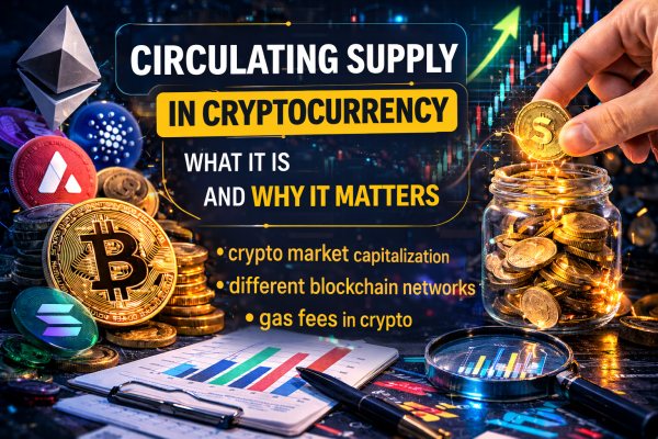
What Is Circulating Supply in Cryptocurrency
Circulating supply is the number of tokens that are currently available for trading on the open market. Not locked. Not vested. Not in a team wallet with a 2-year cliff. Actually out there — in wallets, on exchanges, in liquidity pools — where they can be bought and sold right now.
This sounds simple. It isn’t. The complications start immediately.
What counts as circulating? CoinGecko and CoinMarketCap have different methodologies. A token locked in a smart contract might be counted as circulating by one aggregator and not by another. Staked tokens — locked in a protocol but theoretically available after an unbonding period — are treated inconsistently across projects. Tokens in a foundation wallet that hasn’t moved in three years might be excluded or included depending on who’s doing the counting.
What doesn’t count as circulating supply of cryptocurrency:
- Tokens locked in vesting contracts (team, investor allocations)
- Tokens reserved in project treasury not yet deployed
- Burned tokens (permanently removed from supply)
- Tokens locked in long-term staking with multi-year commitments
- Tokens allocated to future ecosystem grants not yet distributed
The three supply numbers you need to know:
Circulating supply — what’s tradeable now. This is the denominator in market cap calculation.
Total supply — all tokens that exist, including locked ones. Circulating supply is always less than or equal to total supply.
Max supply — the hard cap that will ever exist. Bitcoin’s max supply is 21 million. Many tokens have no max supply — meaning infinite dilution is possible.
The market cap you see on every aggregator is: price × circulating supply. That’s it. Which means two things: it fluctuates with every price move, and it tells you nothing about what happens when the rest of the supply enters circulation.
How Circulating Supply Works: The Mechanics Behind the Number
How Tokens Enter Circulating Supply Over Time
Tokens don’t appear in circulating supply all at once. They enter gradually through several mechanisms:
Vesting unlocks. Team, investor, and advisor allocations release on a schedule. On the unlock date, those tokens move from “locked” to “circulating.” This is the most predictable form of supply increase — the schedule is usually published in advance — and it’s the most commonly ignored by retail buyers.
Staking and validation rewards. Proof-of-stake networks mint new tokens as rewards for validators. Every epoch, every day, new tokens enter circulation. For networks with high staking yields — ALGO circulating supply grows through this mechanism continuously — the annual inflation rate can be 5–15% of current circulating supply.
Ecosystem and grant distributions. Foundation wallets distribute tokens to developers, protocols, and community members over time. These move from treasury (non-circulating) to wallets (circulating) as grants are paid out.
Liquidity mining programs. When protocols distribute tokens as liquidity incentives, those tokens enter circulation immediately — often held by mercenary capital that sells as fast as it receives.
Token price alone does not show the real value of a project — investors should also understand crypto market capitalization and the amount of coins in circulation.
The Circulating Supply Formula
Market Cap = Price × Circulating Supply
Fully Diluted Valuation (FDV) = Price × Max Supply
Supply Inflation Rate = (New tokens issued per year / Current circulating supply) × 100
Dilution Ratio = FDV / Market Cap
When dilution ratio is 1.0 — all tokens are in circulation. When it’s 10.0 — 90% of tokens have yet to enter the market. Every point above 1.0 represents potential future selling pressure.
Why the Same Price Means Different Things
Token A: price $1.00, circulating supply 10 million → Market cap $10 million Token B: price $1.00, circulating supply 10 billion → Market cap $10 billion
Same price. 1,000x difference in actual size. This is why checking circulating supply cryptocurrency data before comparing prices is non-negotiable.
Why Circulating Supply Matters: What It Actually Tells You
It Determines Whether Market Cap Is Real
Market cap is only meaningful relative to what’s actually tradeable. A project with $500 million market cap but 95% of tokens still locked has a real liquid market of maybe $25 million. The reported number is technically correct but operationally misleading — the $500 million figure assumes all those locked tokens are worth the current price, which they won’t be when they hit the market and increase sell pressure.
It Predicts Future Price Pressure With Reasonable Accuracy
An unlock calendar combined with current circulating supply tells you roughly when and how much new sell pressure arrives. If ADA circulating supply is 35 billion today and 2 billion more ADA is scheduled to enter circulation through staking rewards over the next 12 months — that’s roughly 5.7% dilution baked in. Buyers absorbing that dilution need to generate proportionally more demand just to keep price flat.
It Exposes the Real Valuation Gap
The best crypto with low circulating supply relative to total supply isn’t cheap — it’s the opposite. Low circulating supply relative to total supply means most tokens haven’t been priced in yet. When they arrive, they either push price down or require massive new demand. Projects marketed as “low circulating supply” to imply upside potential are often projects with the worst upcoming dilution.
This framing — “low circulating supply means price can go higher” — is one of the most effective misleading narratives in crypto marketing, because it contains a grain of truth (less supply in market can mean less sell pressure today) while burying the actual implication (much more supply is coming).
Where Circulating Supply Becomes Critical: Specific Scenarios
At Token Launch: When the Gap Is Widest
The moment a token lists on an exchange, the circulating supply is typically at its minimum. Maybe 10–20% of total supply is actually in circulation. The price discovered at launch is set by this thin slice of supply. FDV at launch price might be $2 billion for a project whose liquid market is $200 million.
Every subsequent unlock increases circulating supply. Unless demand grows proportionally — which requires continuous new buyers at current or higher prices — the math of dilution works against the token.
During Vesting Cliff Expirations
Twelve months after TGE. Eighteen months. Twenty-four months. These are the cliff expiration dates when investor and team allocations become unlocked. On these dates, entities holding tokens at 10–50x profit from their purchase price have strong incentives to sell.
The sell pressure isn’t guaranteed — some holders are long-term believers. But the incentive exists, the tokens are now available, and price charts show a consistent pattern: tokens frequently underperform around major unlock events.
In Bear Markets: When New Supply Crushes Recovery
During bull markets, new demand absorbs new supply relatively easily. During bear markets, the same unlock schedule hits a market with shrinking demand. Projects that survived the bull market by relying on new buyers to absorb supply face structural collapse when those buyers disappear. The supply keeps coming. The demand doesn’t.
Circulating Supply Across Major Projects: Real Numbers
Chainlink Circulating Supply
Chainlink (LINK) has a max supply of 1 billion tokens. As of 2024, approximately 587 million LINK are in circulating supply — roughly 58.7% of total. The remaining ~413 million are held in ecosystem and team allocations, distributed over time for node operator incentives, development funding, and ecosystem growth.
Chainlink circulating supply has grown gradually as tokens are distributed for operational purposes — not through massive unlock events but through ongoing ecosystem distributions. This gradual release, combined with the mandatory staking demand from node operators, means supply increases are partially absorbed by operational demand. The circulating supply increase rate is moderate compared to typical DeFi tokens.
ADA Circulating Supply
Cardano (ADA) has a max supply of 45 billion tokens. Circulating supply sits around 35.5 billion — approximately 78.9% of max supply. This means the dilution ratio is relatively low: roughly 1.27x. Most ADA is already in circulation.
The ADA circulating supply grows slowly through staking rewards — approximately 0.3–0.5% of total supply per epoch. This is a low, predictable inflation rate by crypto standards. The low dilution ratio means less structural downside from supply increases than most tokens — but it also means the “only 78% in circulation, price could 5x” narrative doesn’t hold. Most of the supply is already priced in.
AVAX Circulating Supply
Avalanche (AVAX) has a max supply of 720 million tokens. Circulating supply is approximately 400 million — around 55.6% of max. Avalanche circulating supply grows through staking rewards (AVAX validators earn approximately 8–11% annually) and ecosystem grants.
The notable feature of AVAX circulating supply: significant allocations to foundations, ecosystem funds, and team were subject to vesting schedules from the 2020 launch. The multi-year vesting meant consistent unlock pressure through 2022–2024. Combined with a high staking yield, AVAX faces meaningful annual inflation — new supply from rewards alone represents several percent of circulating supply annually.
ALGO Circulating Supply
Algorand (ALGO) has a max supply of 10 billion tokens. ALGO circulating supply has been one of the most discussed in crypto because of the aggressive early distribution schedule. Originally the Foundation and company held large reserves distributed over many years — creating consistent, multi-year sell pressure.
By 2024, ALGO circulating supply approaches 8+ billion — over 80% of max supply. The aggressive distribution schedule was both a governance choice and a source of chronic selling pressure for years. ALGO price significantly underperformed relative to its technology reputation partly because supply consistently exceeded demand absorption capacity. The algo circulating supply situation became a textbook example of how distribution schedule affects price regardless of technical merit.
ApeCoin Circulating Supply
ApeCoin (APE) launched in March 2022 with an initial circulating supply of approximately 284 million APE out of a total supply of 1 billion. The allocation structure: 62% to ecosystem fund, BAYC/MAYC holders, and launch contributors — 38% to Yuga Labs, founders, and strategic partners with vesting.
The apecoin circulating supply trajectory was heavily front-loaded for holders (NFT community airdrop), but the 38% in vesting meant consistent unlock pressure. APE launched at $8+ and declined steadily as vesting unlocks hit. By 2023, circulating supply had grown significantly from initial, and price had fallen proportionally. The apecoin circulating supply case shows how even a well-known brand with genuine community support can’t overcome persistent supply pressure if demand doesn’t grow proportionally.
AMP Circulating Supply
Amp (AMP) token has a total supply of approximately 99.4 billion tokens. AMP circulating supply is effectively the near-total supply — most tokens are in circulation. This means the dilution ratio is close to 1.0 — minimal additional supply pressure from unlocks.
The amp circulating supply situation is therefore not a concern from a dilution standpoint. The relevant question for AMP becomes pure demand: if almost all supply is already out there, price movement depends entirely on adoption of the Flexa network. No vesting cliff surprises, no unlock events — just market dynamics.
Many cryptocurrencies operate on different blockchains, so it is important to understand different blockchain networks.
ACH Circulating Supply
Alchemy Pay (ACH) has a total supply of 10 billion tokens with ACH circulating supply of approximately 6.1 billion — roughly 61% of total. The remaining supply is distributed over time through ecosystem development funds and partnerships.
ACH circulating supply is relevant here because it illustrates a common mid-tier token pattern: meaningful supply already circulating, moderate dilution ratio, but price primarily driven by news cycles and narrative rather than structural supply dynamics. For tokens like ACH, supply analysis matters less than adoption metrics.
Risk Score for Circulating Supply Analysis
Risk Score = (Dilution_ratio × Unlock_velocity) + (Concentration × Inflation_rate)
Where each parameter is rated 0 to 5:
- Dilution_ratio — FDV/MC ratio (0 = fully diluted already, 5 = FDV >20x MC)
- Unlock_velocity — % of circulating supply unlocking in next 6 months (0 = none, 5 = >50%)
- Concentration — % of supply controlled by top 10 non-exchange wallets (0 = distributed, 5 = >60%)
- Inflation_rate — annual new token emission as % of current circulating supply (0 = deflationary, 5 = >50%/year)
Scoring:
- 0–6: Low supply risk — other factors dominate
- 7–15: Moderate supply pressure — watch unlock calendar
- 16–25: High dilution risk — structural headwind
- 26–50: Severe supply overhang — price structurally disadvantaged
Real Project Scores
| Project | Dilution_ratio | Unlock_velocity | Concentration | Inflation_rate | Score | Verdict |
|---|---|---|---|---|---|---|
| Bitcoin | 0 | 0 | 1 | 0 | 0 | Benchmark |
| ADA | 1 | 0 | 1 | 1 | 3 | Low risk |
| Chainlink (LINK) | 2 | 1 | 2 | 1 | 7 | Moderate |
| AVAX | 2 | 2 | 2 | 2 | 12 | Moderate |
| ALGO | 1 | 1 | 2 | 2 | 7 | Moderate |
| APE (2022 launch) | 3 | 4 | 3 | 2 | 26 | Severe |
| Typical new L1 | 5 | 5 | 4 | 3 | 47 | Structural trap |
Top Mistakes When Using Circulating Supply Data
Mistake 1: Treating Low Price as Cheap
A token at $0.0001 is not cheap. Price per token is meaningless without circulating supply context. SHIB has a quadrillion tokens in supply — its $0.0001 price gives it a multi-billion dollar market cap. “Getting in early on a low-price token” based on price alone is one of the most common and most expensive retail errors.
Mistake 2: Ignoring the Dilution Ratio
Low circulating supply relative to total supply is typically bad news, not good. It means the majority of tokens haven’t been priced in yet. Best crypto with low circulating supply marketing usually means: “most of our tokens are still locked, and when they unlock they’ll create selling pressure that your investment needs to overcome.”
Mistake 3: Not Checking for Upcoming Unlocks
Circulating supply today is not circulating supply in three months. If a major vesting cliff hits in 60 days, the effective supply is about to change materially. Buying based on today’s circulating supply without checking the unlock calendar is analyzing an old snapshot of a moving picture.
Mistake 4: Using Different Aggregators Without Cross-Checking
CoinGecko and CoinMarketCap sometimes report different circulating supply numbers for the same token. Different counting methodologies — particularly around staked tokens and foundation wallets — create discrepancies. Always cross-reference and check the project’s official documentation for the methodology used.
Mistake 5: Confusing Total Supply and Max Supply
Total supply is tokens that exist now (including locked). Max supply is the hard cap ever. A token can have total supply of 500 million today and max supply of 10 billion — meaning 95% of eventual supply hasn’t been created yet. Staking rewards and ecosystem mining can steadily increase total supply toward max over years.
Mistake 6: Ignoring Burn Mechanisms
Projects that burn tokens reduce both circulating and total supply over time. If you’re looking at a project with significant burn activity — BNB burns quarterly, ETH burns with every transaction — the circulating supply figure is declining. A declining circulating supply with stable or growing demand is deflationary pressure that supports price. A growing circulating supply with static demand is inflationary pressure that suppresses it.
How to Check Circulating Supply: Step-by-Step Guide
Step 1 — Get the Baseline Numbers
Open CoinGecko. Search the token. On the main page: find circulating supply, total supply, max supply, market cap, and fully diluted valuation. Calculate the dilution ratio: FDV / Market Cap. Record all five numbers.
Step 2 — Find the Unlock Calendar
Open TokenUnlocks.app. Search the project. You’ll see a visual timeline of upcoming unlocks — which category of holders, what volume, on what date. Note: what % of current circulating supply arrives in the next 3, 6, and 12 months? Flag anything above 10% in 3 months or 20% in 6 months as significant.
Step 3 — Check On-Chain Distribution
Etherscan (for ERC-20 tokens) → Token contract → Holders tab. Look at top 10–20 holders. Identify which are exchange wallets (often labeled), which are team/foundation wallets, which are unknown. Calculate what % of circulating supply is controlled by the top non-exchange wallets.
For Solana tokens: Solscan. For Cardano: Cardanoscan. For Avalanche: Snowtrace.
Step 4 — Calculate Annual Inflation Rate
Find the project’s staking yield (if applicable) and scheduled token releases. Add them together. Divide by current circulating supply. This gives annual dilution rate. Compare to historical price performance — if inflation rate exceeds price growth, real returns are negative even if nominal price is positive.
Step 5 — Cross-Reference With Official Documentation
Every serious project publishes tokenomics documentation. Find the official supply schedule. Confirm it matches what aggregators show. Discrepancies are worth investigating — they can mean tokens were distributed earlier than disclosed, foundation wallets moved, or aggregator methodology is outdated.
Step 6 — Calculate Risk Score
Use the formula above. Below 10 — supply dynamics are manageable. Above 20 — supply is a structural headwind that product quality alone is unlikely to overcome.
Circulating Supply Analysis Checklist
- ✅ Dilution ratio (FDV/MC) calculated and below 5x
- ✅ Unlock calendar reviewed for next 12 months
- ✅ No major cliff unlocks in next 3 months (>10% of circulating)
- ✅ Top 10 non-exchange wallets hold less than 40% of supply
- ✅ Annual inflation rate below 15%
- ✅ Burn mechanism present and volume meaningful relative to emission
- ✅ Circulating supply methodology verified across CoinGecko and CMC
- ✅ Official tokenomics documentation confirms aggregator data
- ✅ Risk Score below 15
Comparison: How Circulating Supply Profiles Differ Across Major Tokens
| Token | Circulating Supply | Max Supply | % Circulating | Dilution Ratio | Annual Inflation | Supply Risk |
|---|---|---|---|---|---|---|
| Bitcoin (BTC) | ~19.7M | 21M | 93.8% | 1.07x | ~0.8% (halving) | Very Low |
| Ethereum (ETH) | ~120M | No cap | 100%* | 1.0x | ~0% (deflationary) | Very Low |
| Cardano (ADA) | ~35.5B | 45B | 78.9% | 1.27x | ~2% | Low |
| Chainlink (LINK) | ~587M | 1B | 58.7% | 1.70x | ~3% | Moderate |
| Avalanche (AVAX) | ~400M | 720M | 55.6% | 1.80x | ~8% (staking) | Moderate |
| Algorand (ALGO) | ~8B+ | 10B | 80%+ | 1.25x | ~3% | Low-Moderate |
| ApeCoin (APE) | ~625M+ | 1B | 62.5%+ | 1.60x | Vesting unlocks | Moderate-High |
| AMP | ~99B | 99.4B | ~99.6% | 1.0x | ~0% | Very Low |
*ETH has no formal max supply but post-merge burn mechanics make it effectively non-inflationary to deflationary.
How Scammers Use Circulating Supply Against You
The “Low Supply, High Potential” Trap
New project launches with 2% of total supply in circulation. Price at listing looks “low.” Market cap appears tiny — $5 million. FDV is $250 million. Marketing screams: “only 2% is out there — this is a ground floor opportunity!” What they don’t say: the 98% will enter circulation over the next 36 months, and the demand required to absorb it at current prices doesn’t exist. You’re not buying ground floor. You’re buying the beginning of a structured dump.
Fake Burn Announcements to Create Scarcity Narrative
“We just burned 10 billion tokens!” The announcement goes viral. Price spikes 30%. What actually happened: 10 billion tokens out of a 1 quadrillion total supply were burned — 0.001% reduction. The team then sells into the price spike. Real burn mechanisms reduce supply continuously and automatically. Headline burns are often marketing events calibrated to price movements.
Circulating Supply Manipulation Through Lock/Unlock Timing
Some projects keep large portions of supply “locked” in contracts they control — technically non-circulating — then unlock them during price rises to sell into strength, then re-lock to make circulating supply look lower. Without independent on-chain verification, the circulating supply number on aggregators lags the actual situation. Always check on-chain yourself for large positions.
The “Staking Rewards” Dilution Disguise
“Earn 300% APY just by staking!” New tokens minted as rewards increase circulating supply constantly. If the protocol emits 300% new tokens annually and the price falls 90% — your staking “reward” in dollar terms is a loss. The APY number looks attractive. The circulating supply inflation it represents makes the investment structurally losing money for anyone who doesn’t immediately sell rewards.
Phantom Circulating Supply on New Listings
At listing, a project reports 100 million tokens in circulating supply. But 80 million of those are sitting in team wallets that haven’t sold yet — technically “circulating” but functionally controlled supply. Within weeks of listing, those wallets begin distributing. What looked like 100 million truly liquid tokens was actually 20 million, and the price impact of the real distribution is severe.
Who Is at Risk: Investor Profiles Most Vulnerable to Supply Traps
| Profile | Core Vulnerability | How It Manifests |
|---|---|---|
| Price-per-token buyers | Think low price = cheap | Buy high-supply tokens expecting 100x based on price alone |
| FOMO buyers at listing | Enter at maximum FDV | Pay full price when 80–90% of supply is still locked |
| Yield chasers | Attracted by high APY | Ignore inflationary nature of reward emissions |
| Narrative followers | Trust “low supply” marketing | Don’t check FDV or upcoming unlocks |
| Long-term holders | Set and forget | Don’t track unlock calendar, get diluted over years |
| NFT community members | Trust brand over fundamentals | APE launch taught this lesson expensively |
| Retail in new chain ecosystems | Excited by new technology | Ignore that 70–80% of supply is still locked at launch |
When Circulating Supply Analysis Does NOT Work
Circulating supply analysis is powerful but not universal:
- Meme coins and community tokens. SHIB, DOGE, PEPE — price is driven by social dynamics, not supply analysis. DOGE has unlimited inflation and has still outperformed many “sound” tokens during bull markets. Supply fundamentals don’t predict meme coin prices.
- Fully diluted tokens. When circulating supply equals or approaches max supply — AMP, older tokens with minimal locked supply — supply analysis tells you little. The relevant question becomes purely demand-side.
- Algorithmic stablecoins. Supply expands and contracts by design. Analyzing circulating supply of an algo stablecoin requires understanding the stability mechanism, not just the number.
- Bitcoin. At 93%+ of max supply already mined, remaining supply growth is minimal and perfectly predictable. Supply analysis is effectively complete — only demand matters for BTC price.
- Short-term trading. On a 24-hour or even 30-day basis, technical price action and market sentiment dominate. A token can pump 200% despite terrible supply dynamics if the narrative is strong enough. Supply analysis is a medium-to-long-term tool, not a momentum indicator.
Myths About Circulating Supply
| Myth | Reality |
|---|---|
| “Low price means cheap token” | Price is meaningless without supply context. Market cap is the measure of size |
| “Low circulating supply means price can go higher” | Low circulating supply relative to total usually means more dilution is coming |
| “High circulating supply means token is oversupplied” | Depends entirely on demand. BTC has high % circulating and maintains value |
| “Burning tokens guarantees price increase” | Only if burn volume meaningfully exceeds new emission |
| “Staking reduces circulating supply” | Staking reduces tradeable supply temporarily but staking rewards increase total supply |
| “CoinGecko and CMC circulating supply numbers are always accurate” | Both use different methodologies and can lag on-chain reality |
| “FDV doesn’t matter for established projects” | FDV matters whenever significant supply is still locked, regardless of project age |
| “Best crypto with low circulating supply is always a good buy” | Low circulating supply relative to total is often a warning sign, not an opportunity |
Frequently Asked Questions (FAQ)
What is circulating supply in crypto?
The number of tokens actively tradeable on the market right now — not locked, not vested, not in a team wallet. It’s the denominator used to calculate market cap. Market cap = price × circulating supply. Tokens in vesting, held in treasury, or locked in long-term contracts are not circulating.
Why does circulating supply matter for price?
Because price per token is meaningless without it. Two tokens at the same price can have market caps 1,000x apart depending on their circulating supply. And future price is partly determined by how much additional supply will enter the market — more supply with static demand means lower price.
What’s the difference between circulating supply, total supply, and max supply?
Circulating supply is tradeable now. Total supply includes all existing tokens including locked ones. Max supply is the hard cap that will ever exist. Bitcoin: 19.7M circulating, 19.7M total, 21M max. A typical new DeFi token might have 50M circulating, 500M total, 1B max — meaning 95% of eventual supply hasn’t appeared yet.
What is fully diluted valuation and how does it relate to circulating supply?
FDV = price × max supply. It’s the market cap if every token ever to exist were trading at current price. If FDV is 20x the actual market cap, 95% of supply hasn’t been priced in. Either the price needs to grow 20x to justify FDV, or it needs to fall as the remaining supply enters circulation. The ratio FDV/MC is one of the most important supply metrics.
How do I check the circulating supply of a specific token?
CoinGecko or CoinMarketCap for the current figure. TokenUnlocks.app for the unlock schedule. Etherscan/Arbiscan/Solscan for on-chain verification of actual holder distribution. Cross-reference all three — aggregators can lag on-chain reality, especially for newly unlocked allocations.
Is low circulating supply good or bad for a crypto?
Context-dependent. Low circulating supply relative to max supply usually means significant future dilution is coming — which is structurally negative for price. Low circulating supply in absolute terms on a new listing means price discovery is happening with limited supply, making early price easily manipulated in either direction.
What is chainlink circulating supply and how does it affect LINK price?
Chainlink has approximately 587 million LINK in circulating supply out of 1 billion total. Roughly 413 million remain for ecosystem distributions and node incentives. The supply increases gradually rather than through large unlock events, and each increase is partially offset by growing mandatory staking demand from node operators. The dilution ratio of ~1.70x is moderate — better than most DeFi tokens, manageable given structural demand.
How does ADA circulating supply compare to other major cryptocurrencies?
ADA has approximately 35.5 billion tokens circulating out of a 45 billion max — 78.9% of max supply is already out. The dilution ratio of 1.27x is among the lowest in crypto. Inflation comes primarily from staking rewards at low rates. This makes ADA supply dynamics relatively benign compared to newer L1s with 50–60% of supply still locked.
What does it mean when a project has “best crypto with low circulating supply”?
Usually a marketing claim trying to imply upside potential by suggesting most supply is still locked and will release gradually as demand grows. In reality, low circulating supply relative to total typically means significant future selling pressure from vesting unlocks. It’s the opposite of what the marketing implies for most projects.
How often does circulating supply change?
Constantly. Every block that mints staking rewards, every vesting contract release, every ecosystem grant distribution — all increase circulating supply. For tokens with high staking yields like ALGO or AVAX, circulating supply increases daily. For tokens with quarterly vesting unlocks, it changes in steps. Always check the current figure, not one you remember from months ago.
Conclusion: Three Rules, One Principle, One Hard Criterion
Rule 1. Never evaluate a token’s price without knowing its circulating supply, total supply, and FDV. Price per token in isolation is not information — it’s a number waiting for context. Market cap is the minimum unit of meaningful comparison. FDV is what you need to understand future dilution.
Rule 2. Check the unlock calendar before buying. Circulating supply today is not circulating supply in six months. If a major vesting cliff arrives in the next 90 days — especially for investor or team allocations at significant profit — you’re buying ahead of scheduled selling pressure. That’s not prohibited, but it needs to be a conscious decision.
Rule 3. Calculate the dilution ratio (FDV/MC) for every token you’re considering. Below 2x — most supply is priced in, supply risk is low. Above 10x — 90% of eventual supply is still coming. At current price, the project would need to sustain a valuation of 10x its current market cap just to justify the FDV. Most can’t.
The principle: circulating supply is not a static number. It’s a schedule. The schedule determines when selling pressure arrives, in what volume, from which holders. Reading that schedule before buying is not advanced analysis — it’s basic due diligence that most retail investors skip because aggregators make it slightly inconvenient to find.
The hard criterion: if a project’s FDV is more than 10x its market cap and you can’t identify a specific reason why demand will grow proportionally as the remaining supply unlocks — you’re not buying an undervalued asset. You’re providing exit liquidity for people who bought before you did.
Read more:
- What Is Crypto Market Capitalization — why market cap matters more than token price.
- Gas Fees in Crypto Explained — how blockchain transaction fees affect token usage.
- Ethereum, BSC and Solana Networks Guide — how different blockchain networks work.
- Can a Crypto Wallet Address Be Hacked — understanding wallet address security.
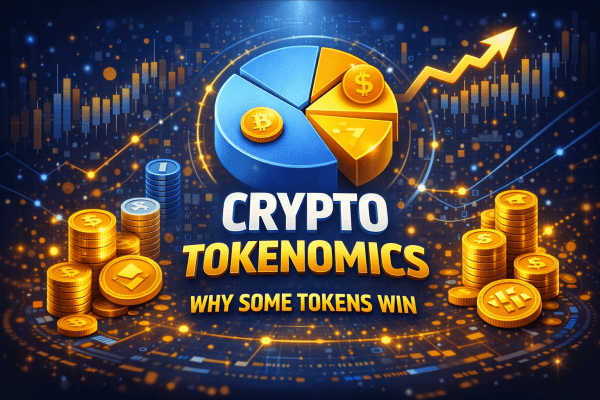
Introduction: You Bought the Token. Now It’s Down 90%. Here’s Why.
You did the research. Strong team, working product, real partnerships. You bought the token. Three months later — down 70%. Six months — down 90%. The product still works. Users are there. The token is in ruins.
That’s not bad luck. That’s tokenomics.
Specifically — broken tokenomics. Designed, sometimes deliberately, so the token can’t appreciate regardless of how good the product is. Inflation eats holders alive. Insiders dump on schedule. Incentives point in the wrong direction.
The other side of this exists too. There are tokens that hold value even in bear markets — not because the project is the best in the world, but because the economic design makes holding rational and selling costly. That’s not accident. That’s engineering.
This guide covers the full picture: what tokenomics meaning actually is in practice, how to read any token’s economics before buying, how to evaluate chainlink tokenomics versus a typical new L1, what designing tokenomics well looks like, and where to learn tokenomics using the best tokenomics websites available. Every major concept here is grounded in real projects — aptos tokenomics, dydx tokenomics, lido tokenomics, optimism tokenomics, 1inch tokenomics, hivemapper tokenomics, hashflow tokenomics — with real numbers.
What Is Tokenomics: The Actual Meaning Beyond the Buzzword
Tokenomics meaning, practically: the economic system of a token. Everything that determines its supply, distribution, emission rate, burn mechanisms, holder incentives, and the conditions under which someone will want to buy it — or sell it.
The word combines “token” and “economics.” But it’s not academic. It’s an analytical framework that answers one question: who benefits from holding this token, who benefits from selling it, and when.
A whitepaper describes the technology. Tokenomics describes the game. And in that game, different participants — the team, venture funds, early investors, retail — have fundamentally different positions and fundamentally different interests. Most retail buyers read about the product and team. A small minority look at the vesting schedule, unlock calendar, and emission rate. That minority avoids the scenario in the opening paragraph.
The Core Components of Tokenomics
Total supply and max supply. Total supply is how many tokens exist now. Max supply is the hard maximum that will ever exist. Bitcoin’s max supply is 21 million — a fixed ceiling. Many DeFi tokens have no max supply at all, meaning infinite dilution is theoretically possible.
Circulating supply. How many tokens are actively trading on the market right now. The gap between total and circulating is tokens not yet released — held by the team, investors, locked in vesting, sitting in the treasury. This gap is potential selling pressure that hasn’t materialized yet.
Fully Diluted Valuation (FDV). The implied market cap if every token in the max supply were trading at the current price. If FDV is 20x the market cap, 95% of all tokens haven’t hit the market yet. Either the price needs to grow 20x to justify current valuation, or it needs to fall when those tokens arrive. The second outcome is far more common.
Emission rate and inflation. How quickly new tokens are minted. 5% annual inflation is manageable. 200% annual inflation — common in 2021 yield farming protocols — is a death sentence for price unless demand grows faster than supply, which it almost never does.
Vesting and unlock schedule. The timetable by which team members, investors, and advisors receive their allocated tokens. The cliff is the initial lockup period — no one gets anything until it ends. After cliff, regular unlocks begin, typically monthly or quarterly. The most predictable price drops in crypto history happen at large unlock dates.
Token utility. The honest answer to: why would anyone hold this token other than to sell it later at a higher price? This question separates tokens with structural demand from tokens running purely on narrative.
How Tokenomics Works: The Mechanics You Need to Understand
Vesting and Unlocks: When Insiders Hit the Market
Standard structure: 12-month cliff, then 24–36 months of linear vesting. This means that 12 months after the TGE (token generation event), early investors start receiving tokens monthly. Venture funds that bought at $0.05 with a current market price of $1 are sitting on a 20x gain. They don’t need to wait for more upside — they sell. Especially when the next unlock is a month away.
This is why token price charts often look identical: sharp rise after TGE, then a steady grind lower as monthly unlocks hit. It’s not manipulation in the illegal sense. It’s math working exactly as designed — for insiders.
Burn Mechanisms: When Destruction Actually Matters
Burn means permanently destroying tokens to reduce supply. Two types: automatic (the protocol burns on every transaction) and discretionary (the team burns based on a decision).
Ethereum’s EIP-1559 introduced automatic burning of a portion of base fees on every transaction. During periods of high network activity, ETH issuance turned negative — more ETH was destroyed than created. This is not marketing. This is deflationary pressure built into the protocol’s economic layer.
Burn matters only when the volume burned is meaningful relative to issuance. Burning 0.01% of supply annually while emitting 20% annually is a rounding error dressed up as tokenomics.
Token Utility: What Creates Structural Demand
Utility types that create real, structural demand:
- Gas payment — ETH, SOL, APT. The network doesn’t run without the token
- Mandatory collateral for node operation — LINK in Chainlink; operators must stake
- Revenue sharing — real protocol fees distributed to holders (GMX, SNX, dYdX v4, 1INCH)
- Collateral in lending protocols — MKR, AAVE
- veTokenomics lockup — locking for governance rights and yield boosts (CRV, BAL)
Utility types that don’t create structural demand:
- “Future features we’re building”
- “5% discount on our platform”
- “Access to our community”
If the only reason to hold is the hope of selling higher to someone else, that’s not utility. It’s a value transfer mechanism from late buyers to early buyers.
Why Tokenomics Matters More Than Technology for Investment Decisions
Markets don’t price technology directly. Markets price the balance of supply and demand. A technically superior project with broken tokenomics will see its token decline. A mediocre project with excellent tokenomics can sustain price for years.
The mistake most people make: comparing transaction speeds, consensus mechanisms, developer ecosystems — while ignoring the economic layer entirely. It’s like evaluating a business purely on product quality without looking at debt structure and cash flow.
The product and the token are separate things. They can both be excellent. They can both be poor. Or one can be excellent while the other is broken. Evaluating them separately is not optional — it’s the minimum standard.
Where Tokenomics Applies: Real Project Models Analyzed
Chainlink Tokenomics: Mandatory Collateral as Structural Demand
Chainlink tokenomics is built around a simple but powerful mechanic: LINK is required collateral for node operators. Without staked LINK, a node cannot process data requests or participate in the network. This creates demand that scales directly with the number of operators — which scales with adoption of Chainlink across DeFi protocols.
This isn’t speculative demand. It’s operational necessity. Every new integration that requires a Chainlink oracle creates demand for more operators, which creates demand for more LINK to be staked and locked.
Staking v0.1 launched in 2022, v0.2 in 2023 — adding a revenue-based layer where LINK stakers earn rewards for securing the network. This stacks revenue utility on top of the existing operational demand. Among infrastructure token models, chainlink tokenomics represents one of the cleaner examples of demand tied to real usage rather than narrative.
Read: gas fees in crypto
Aptos Tokenomics: L1 Gas Model With Concentration Risk
Aptos tokenomics follows the classic L1 model: APT is required to pay gas fees. No APT means no transactions. That’s the floor of structural demand — it grows directly with network activity.
Staking APT earns approximately 7% annually through delegation to validators, which creates an additional holding incentive beyond speculation.
The weakness in aptos tokenomics is concentration and unlock schedule. At launch in October 2022, roughly 48% of supply was allocated to the Aptos Foundation and Core Contributors with a 4-year vesting schedule. Structurally, 4-year vesting sounds conservative. In practice, the unlock cadence created consistent selling pressure through 2023–2024 as monthly unlocks hit a market with limited absorptive capacity. The product works. The token faced headwinds from its own supply schedule.
dYdX Tokenomics: A Case Study in Deliberate Evolution
dYdX tokenomics underwent one of the most significant structural redesigns in DeFi history — and the before/after comparison is instructive for understanding what actually drives token value.
dYdX v3 (Ethereum): DYDX was a governance token. Holders voted on protocol parameters. That’s it. No revenue sharing, no direct financial benefit from holding. Governance over parameters that rarely changed doesn’t create meaningful demand. Selling pressure from team and investor unlocks wasn’t offset by any structural buy pressure. Result: chronic underperformance relative to the protocol’s genuine success as a trading venue.
dYdX v4 (dYdX Chain, 2023): The protocol launched its own Cosmos-based blockchain. DYDX stakers now receive a direct share of trading fees. The protocol generates real revenue — $10–50M annually in fees — and a meaningful portion flows to stakers. Same token, same team, fundamentally different economic model. Holders now own a piece of a cash-flowing business rather than a governance credential.
This is designing tokenomics in practice: honest diagnosis of what isn’t working, followed by a structural fix.
Read: different blockchain networks
Hivemapper Tokenomics: Emission Tied to Real Work
Hivemapper tokenomics solves the problem that killed most GameFi projects: HONEY tokens are earned for real, useful work — driving with a dashcam and contributing street-level imagery to a decentralized map. Not for time elapsed. Not for capital deposited. For a specific physical contribution to a product people actually need.
Emission is controlled through the Map Progress Multiplier — areas with insufficient map coverage generate higher rewards, oversaturated areas generate lower. This creates a self-regulating mechanism: inflation is tied to real demand for data, not to speculative participation. When no one needs more coverage of a given area, rewards there fall. This is the structural solution to Axie Infinity’s problem, applied to a different vertical.
Hashflow Tokenomics: Fee Discounts and the Limits of Discretionary Utility
Hashflow tokenomics uses the HFT token in two roles: fee discounts for active traders on the platform, and governance over treasury and protocol parameters.
Fee discount utility is real — it creates a reason to hold HFT if you’re an active trader on Hashflow. But it’s conditional: the utility only exists if the platform is actively used. During low-volume periods, structural demand for HFT essentially disappears. This makes hashflow tokenomics more cyclical than models built on mandatory collateral or protocol-level gas requirements. It’s not broken — it’s just weaker than it appears during bull markets.
Optimism Tokenomics: Governance With Real Financial Stakes
Optimism tokenomics introduced something rare in governance design: voting that controls the allocation of real money to real projects. The Retroactive Public Goods Funding mechanism directs a portion of network revenue to fund open-source projects with proven impact, determined by OP holder votes.
The stakes are genuine. Holders aren’t voting on abstract parameters — they’re deciding where tens of millions of dollars flow. This created organic community formation around the governance process: people who care about outcomes, not just price speculators holding for exit liquidity.
OP has a high FDV-to-market-cap ratio at launch — significant supply is reserved for ecosystem grants and future distributions. This creates long-term selling pressure, partially offset by growing network activity on the Optimism stack. The model is imperfect but the governance mechanism is one of the most thoughtfully designed in the L2 space.
1inch Tokenomics: The Transition From Empty Governance to Revenue Sharing
1inch tokenomics initially centered on governance — 1INCH holders vote on aggregator parameters. This worked poorly for the same reason pure governance always works poorly: few people hold a token specifically to vote on parameters they don’t deeply understand.
In 2022, staking was upgraded to distribute a share of protocol spread to stakers — real income from real swap activity flowing through the 1inch aggregator. The change was immediate in its effect on the token’s value proposition: holding 1INCH became economically rational on its own merits, independent of future price appreciation. Every swap through 1inch generates a small amount of revenue. Stakers receive a portion. The token’s value is now connected to a real business metric. That’s the difference between 1inch tokenomics today and the original model.
Lido Tokenomics: Governance Over Billions Without Direct Revenue to Holders
Lido tokenomics presents an instructive tension. The protocol manages over $20 billion in staked ETH at peak — the largest liquid staking protocol by TVL. It generates substantial real revenue: approximately 10% of staking rewards, which has historically amounted to $200–500M annually depending on market conditions.
LDO holders govern this protocol through DAO voting — controlling fee parameters, the operator set, and treasury allocation. The problem: LDO holders don’t receive a direct share of that revenue. It flows into the DAO treasury, which the DAO then allocates through governance.
This creates the core criticism of lido tokenomics: you’re governing a business that generates hundreds of millions per year but you’re not a direct beneficiary of that revenue as a token holder. The value of LDO is tied to the value of control over that treasury — indirect and speculative rather than direct and calculable. Whether the protocol should introduce direct revenue sharing is an ongoing governance discussion and arguably the most important unresolved question in lido tokenomics.
Designing Tokenomics: How Token Economics Are Built From Scratch
Designing tokenomics is not “how many tokens should we issue.” It’s a sequence of interconnected decisions that determine the entire economic life of the protocol.
Question 1: What should the token actually do? Gas, mandatory collateral, revenue sharing, governance, or a combination. The more mandatory the demand — the more structural and resilient the model.
Question 2: Who gets tokens and when? The distribution that has held up over time: no more than 20% to team and advisors, no more than 20% to investors, minimum 40% to ecosystem and community. Team vesting: minimum 3–4 years with cliff. Anything shorter signals that the team views the token as an exit vehicle.
Question 3: How do you balance emission and sink mechanisms? Emission creates inflation. Sink mechanisms — burn, mandatory collateral lockup, long-term staking — create deflation or reduce sell pressure. The goal is equilibrium or net deflation at maturity. Ethereum achieved this. Most projects aim for it and miss.
Question 4: How do you prevent Sybil attacks and concentration? If a single entity can acquire a disproportionate share through farming, that’s a systemic risk. Hivemapper addresses it by tying rewards to physical work. Curve addresses it through multi-year lockup. The mechanism matters less than the result: no single entity should be able to cheaply acquire outsized influence over the token supply.
Question 5: How does the model evolve? dYdX and 1inch both demonstrate that tokenomics can be redesigned. Building governance that can actually change emission parameters, fee routing, and distribution mechanisms is better than locking in a static model. Static models become obsolete. Governable models can adapt.
Where to Learn Tokenomics: Best Tokenomics Websites and Resources
This deserves a dedicated section because “learn tokenomics” is a specific need with specific answers.
Essential Tokenomics Websites for Analysis
Messari.io — the highest-quality source for structured tokenomics data. Messari tokenomics profiles include supply breakdown, vesting schedules, investor allocations, and revenue metrics. The free tier covers basic data for most major projects. Pro subscription unlocks detailed research reports that are among the best available anywhere. If you’re going to use one tokenomics website seriously, start here.
TokenUnlocks.app — purpose-built for unlock calendar tracking. Enter any major project and see exact dates and volumes of upcoming token releases for the next 12–24 months. This is the tool that tells you when insider selling pressure is scheduled to arrive. Non-negotiable for any serious analysis.
Token Terminal — financial metrics for DeFi protocols: revenue, fees, price-to-sales ratios, active users. Lets you evaluate a token as a financial asset with real cash flows rather than purely as a speculative instrument. Particularly valuable for comparing revenue-bearing protocols.
Nansen.ai — on-chain analytics with wallet labeling. Identifies smart money wallets, tracks large holder movements, and shows you who actually owns what — as opposed to what the documentation claims. Essential for verifying that declared distribution matches on-chain reality.
CoinGecko and CoinMarketCap — baseline data on supply, circulating supply, FDV, and market cap. Starting point for any analysis, not the endpoint.
Etherscan / Arbiscan / Solscan — direct access to on-chain data. The Token → Holders tab shows actual distribution independent of what any document says. A 5-minute check here can reveal concentration that no whitepaper will advertise.
Where to Learn Tokenomics Systematically
Tokenomics DAO — community and educational content specifically focused on token economics. Real case study breakdowns, analysis templates, practitioner discussions.
Messari Research — paid reports with deep tokenomics analysis of specific projects. One of the best sources for professional-grade understanding of how specific models work and why.
Delphi Digital — research firm with both public and premium content on tokenomics and DeFi economics. Long-form pieces that go beyond surface-level description.
Bankless and Uncommon Core — podcasts and newsletters with regular breakdowns of specific project tokenomics from practitioners who manage real capital.
Primary sources — whitepaper and docs for every project you’re seriously considering. The discipline of reading first-party documentation rather than aggregator summaries is itself the practice of learning tokenomics. No shortcut replaces it.
Tokenomics Risk Score: A Formula for Evaluating Any Token Before You Buy
Risk Score = (Inflation × Concentration) + (FDV_ratio × Unlock_pressure)
Each variable rated 0 to 5:
- Inflation — annual emission as % of circulating supply (0 = none, 5 = >100%/year)
- Concentration — share of top 10 wallets in supply (0 = distributed, 5 = >50% with insiders)
- FDV_ratio — FDV divided by market cap (0 = equal, 5 = FDV >20x MC)
- Unlock_pressure — volume of unlocks in next 6 months as % of circulating supply (0 = none, 5 = >50% incoming)
How to read the result:
- 0–6: Healthy tokenomics — worth deeper analysis
- 7–15: Moderate risk — watch specific unlock dates closely
- 16–25: High selling pressure — need compelling reasons to hold through it
- 26–50: Structurally broken — price is under chronic pressure by design
Scoring Real Projects
| Project | Inflation | Concentration | FDV_ratio | Unlock_pressure | Score | Verdict |
|---|---|---|---|---|---|---|
| Bitcoin | 0 | 1 | 0 | 0 | 0 | Benchmark |
| Ethereum (post-merge) | 0 | 1 | 0 | 0 | 0 | Deflationary model |
| Chainlink (LINK) | 1 | 2 | 1 | 1 | 5 | Healthy |
| Optimism (OP) | 2 | 2 | 3 | 3 | 15 | Moderate risk |
| Aptos (APT) | 2 | 3 | 2 | 3 | 15 | Moderate risk |
| Typical new L1 (2023) | 4 | 4 | 5 | 5 | 45 | Structural dump |
| Typical GameFi (2021) | 5 | 4 | 4 | 5 | 45 | Terminal inflation |
Top Mistakes When Analyzing Tokenomics
Mistake 1: Looking at Market Cap Instead of FDV
Market cap at listing — $50M. Sounds modest. FDV — $2B. At current price, the project is valued at 40x its real market. When all tokens reach circulation — either price grows 40x, or it falls proportionally as supply expands into static demand. Most retail buyers see only the first number.
Mistake 2: Ignoring the Unlock Calendar
“The team is locked for 2 years” sounds reassuring. Open TokenUnlocks.app. Every unlock date is there. Series A investors locked for 12 months, then 18 months of vesting. In 12 months they start receiving tokens. At 10x profit they sell. The question isn’t whether they’ll sell. The question is whether enough buyers exist at that price.
Mistake 3: Confusing High APY With Real Returns
“5,000% annual staking rewards!” is not a return. It’s inflation described differently. If a protocol pays 5,000% APY in new tokens and the token price falls 99%, your real return is deeply negative. Real yield means income derived from actual protocol revenue — not printed tokens.
Mistake 4: Believing Burn Solves Everything
Burn matters only when its volume is meaningful relative to issuance. Ethereum achieved this. Burning 1% annually while emitting 20% is a press release, not economics.
Mistake 5: Trusting Declared Distribution Without Checking On-Chain
The documentation says “40% goes to the community.” Etherscan shows those community wallets are controlled by one team multisig. Always verify actual distribution through Nansen, Arkham, or directly on-chain. Declared and actual are different things more often than they should be.
Mistake 6: Buying a Token Because “The Project Is Good”
A good product and good tokenomics are separate attributes. A protocol can have millions of active users and a token that falls every month because of relentless unlock pressure. Evaluate them independently. Always.
How to Analyze Tokenomics Step by Step: A Practical Guide
30–60 minutes per project. Minimum before any purchase above $500.
Step 1 — Gather Baseline Data
CoinGecko: total supply, circulating supply, FDV, market cap. Calculate FDV/MC ratio. Above 10x — flag it and find an explanation before continuing.
Step 2 — Find the Detailed Tokenomics
Official project docs → Tokenomics section. Messari.io profile. Record: allocation breakdown by category (team, investors, community, ecosystem, treasury), cliff and vesting period for each category.
Step 3 — Check the Unlock Calendar
TokenUnlocks.app. What % of current circulating supply arrives on market in the next 6 months? Above 20% — significant pressure. Above 50% — you’re likely buying ahead of a structured insider exit.
Step 4 — Verify On-Chain Distribution
Etherscan → Token → Holders. Who are the top 10? If 3–5 wallets hold 50–70% of supply, concentration is high. Nansen or Arkham Intelligence can identify whose wallets those actually are.
Step 5 — Evaluate Utility Honestly
One question: why would anyone hold this token other than to sell it? Is there mandatory demand (gas, collateral)? Is there revenue sharing with real money? Without an honest answer — don’t buy.
Step 6 — Calculate the Risk Score
Use the formula. Above 15 — you need exceptional arguments for buying right now, not just confidence in the project.
Safe Tokenomics Checklist
- ✅ FDV / Market Cap below 5x
- ✅ Team vesting longer than 2 years with cliff
- ✅ Unlocks in the next 6 months below 15% of circulating supply
- ✅ Top 10 holders below 40% of supply
- ✅ Mandatory utility exists (gas, collateral, required payment)
- ✅ Annual inflation below 15% of current supply
- ✅ Burn mechanism tied to real protocol activity
- ✅ Tokenomics documented in detail with verifiable data
- ✅ On-chain distribution matches declared distribution
- ✅ Risk Score below 15
Real Cases: How Tokenomics Determined Project Outcomes
Case 1: Axie Infinity SLP — The Textbook on Hyperinflation Death
Early 2021. Axie Infinity — 2 million daily active users, SLP peaking at $0.35. The mechanic was simple: players earned SLP by winning battles, and SLP was required to breed new Axies. The fatal flaw: SLP emission grew proportionally with the player count while demand for SLP (breeding) grew much slower. The economy required a constant flow of new players buying SLP from existing players. When growth stalled — inflation overwhelmed demand.
January 2022: $0.03. Mid-2022: $0.002. A 99.4% decline over 18 months while the user base was larger than ever. Unlimited emission with an inadequate sink mechanism isn’t a token — it’s a countdown timer. Every GameFi project that collapsed in 2022 ran a variation of this same model.
Case 2: Curve Finance veTokenomics — Engineering Away Sell Pressure
Curve in 2020 faced a structural problem: CRV tokens were farmed by liquidity providers and immediately sold. Price falls. LPs receive less value in dollar terms. They leave. Price falls further. Classic death spiral.
The solution — veTokenomics. Maximum rewards and voting rights require locking CRV for up to 4 years (receiving veCRV in return). Locked tokens can’t be sold. This created the “Curve Wars” — DeFi protocols competed intensely for veCRV to direct emissions to their liquidity pools. Convex Finance built an entire business around this with $4B+ TVL at peak. A single tokenomics design decision became the foundation for an entire ecosystem. That’s what thoughtful designing tokenomics looks like at scale.
Case 3: dYdX — What Happens When You Rebuild the Economic Model
The before/after comparison in dYdX tokenomics is one of the clearest demonstrations of how much tokenomics matters independently of product quality.
v3: governance token, no revenue sharing, chronic underperformance despite being one of the highest-volume decentralized exchanges in existence. The product was excellent. The token had no structural reason to appreciate.
v4: revenue sharing with stakers, own blockchain, real financial connection between protocol success and token value. Same team, same product reputation, fundamentally different economics. The redesign validates the core thesis: product quality and token economics are separate variables. Both need to be right.
Case 4: Lido LDO — The Unresolved Tension in Governance Token Design
Lido manages $20B+ in staked ETH, generating $200–500M annually in protocol revenue. LDO holders govern this through DAO voting. But LDO holders receive no direct share of that revenue — it flows to the treasury, which the DAO allocates.
This creates a calculable gap: if Lido introduced direct revenue sharing to LDO stakers, you could value LDO like an equity stake in a cash-flowing business. At $300M annual revenue with a reasonable P/E multiple, the implied token value would be substantially higher than current market pricing. The gap between current price and implied value-if-revenue-sharing-existed is the market’s discount for governance-without-cashflow. Whether that discount closes depends on a governance vote that hasn’t happened yet. This is the central unresolved question in lido tokenomics — and understanding it is more useful than any price target.
Comparison: Tokenomics Models That Work vs Models That Don’t
| Model | Projects | Demand Mechanism | Sell Pressure | Long-term Durability |
|---|---|---|---|---|
| Gas token | ETH, SOL, APT | Mandatory — network doesn’t work without it | Low | High |
| Mandatory collateral | LINK | Operational necessity for nodes | Low | High |
| veTokenomics | CRV, BAL | Lockup for governance rights + yield boost | Very low | High |
| Revenue sharing | GMX, SNX, dYdX v4, 1INCH | Real protocol fees to holders | Moderate | High |
| Governance + treasury | LDO, early UNI | Control over real resources | Moderate | Medium |
| Pure governance | Early COMP, early dYdX | Symbolic voting rights | High | Low |
| Fee discount | HFT, early BNB | Discounts for active platform users | Moderate | Medium |
| Farming rewards | SLP, most 2021 GameFi | Only value is selling reward tokens | Very high | Very low |
| DePIN work-based | HONEY (Hivemapper) | Tied to real physical contribution | Low | High if product survives |
How Scammers Use Tokenomics Against You
“Fair Launch” With Unfair Distribution
“Fair launch — no premine, no investors, everyone equal.” In practice: several wallets know the exact launch time and acquire 30–40% of supply in the first seconds through sniper bots. Result: the same insider concentration as a VC-backed project, minus the legal vesting obligations and public accountability.
Fake Burn as Marketing
“We burned 1 billion tokens!” — thousands of retweets. The project burned 1 billion out of 100 trillion — 0.001% of supply — while emitting 20% annually. The question to always ask: what percentage of total supply was burned, and how does that compare to annual issuance?
Pseudo-Utility to Sustain Price During Exit
The team creates artificial demand: the token is required for access to an NFT mint, an exclusive Discord tier, a beta product. This isn’t real utility — it’s a temporary mechanism to sustain price while insiders exit. When the exit is complete, the utility quietly disappears.
Retroactive Vesting Changes
“For the long-term benefit of the ecosystem, we’re accelerating the team unlock.” This happens when the team wants out before their schedule allows. Any retroactive change to vesting terms that benefits insiders after TGE is the highest-level red flag in tokenomics. It means the people who wrote the rules are now breaking them.
Unlock FUD Manipulation
The reverse scheme: affiliated accounts create fear around an upcoming unlock — “everything will dump when it unlocks.” Retail sells. Insiders buy at the low. The unlock passes quietly with minimal price impact. Those who sold bought back higher. Understanding the actual mechanics of unlocks — not just the fear — is the defense.
Who Is at Risk: Investor Profiles That Consistently Lose on Tokenomics
| Profile | Typical Mistake | Why They Lose |
|---|---|---|
| FOMO buyer | Buys at peak hype after listing | Enters directly into insider unlock zone |
| Yield farmer | Chases high APY | Inflation consumes nominal return |
| Tech enthusiast | Evaluates technology only | Ignores the token’s economic layer entirely |
| Long-term holder | Holds a “good project” | Doesn’t notice structural selling pressure accumulating |
| VC portfolio copier | Replicates fund allocations | Buys at retail price what VCs bought at 0.01x |
| DeFi newcomer | Sees “5,000% APY” | Doesn’t understand inflationary reward mechanics |
| Technical trader | Over-relies on chart patterns | Buys “support” without knowing an unlock hits in a week |
When Tokenomics Does NOT Work: Honest Limitations
Even excellent tokenomics doesn’t guarantee appreciation:
- Bear markets compress everything. ETH lost 80% in 2022 despite deflationary mechanics post-merge. Good tokenomics is protection against structural collapse, not market cycles.
- No product-market fit. Chainlink’s tokenomics is excellent. If no one needs oracles, LINK falls regardless. Tokenomics amplifies a good product — it doesn’t substitute for one.
- Regulatory action. The SEC or CFTC designating a token as a security can break any model regardless of its elegance. dYdX migrated partly in response to this exact risk.
- Smart contract exploit. If a protocol is drained through a vulnerability, tokenomics is irrelevant. Code security comes first.
- Competitor with better incentives. Blur entered with better tokenomics than OpenSea — not necessarily a better product initially, but better economic incentives for the users who mattered. Token design is competitive strategy.
Myths About Tokenomics
| Myth | Reality |
|---|---|
| “Small supply means high price” | Price = MC / supply. 1 million tokens at $0.001 is $1,000 market cap |
| “Burn always helps” | Burn matters only if volume exceeds or matches emission |
| “High APY is good yield” | APY in inflationary tokens is inflation described as income |
| “VC backing means good tokenomics” | VCs buy cheap and sell expensive. Their presence doesn’t protect retail |
| “Governance tokens grow with the protocol” | Only if governance creates real cash flow to token holders |
| “Fair launch is the most honest model” | Without anti-sniper protection, concentration is identical — just less public |
| “Staked tokens reduce supply permanently” | Staked tokens can be unstaked. It’s deferred supply, not destroyed supply |
| “Good project means good token” | Product and tokenomics are separate attributes. Evaluate them separately |
Frequently Asked Questions (FAQ)
What does tokenomics mean in simple terms?
The economic system of a token — how many exist, when more are released, who holds them, why someone would want to, and what prevents the price from being structurally pushed down. In one sentence: tokenomics answers who benefits from holding and who benefits from selling — and when.
Where do I find tokenomics data for a specific project?
Start with official project docs. Then Messari.io for structured profiles. TokenUnlocks.app for the unlock calendar. Etherscan Token → Holders for on-chain distribution. Those four sources together give you the complete picture in under an hour.
What is FDV and why does it matter?
Fully Diluted Valuation — the implied market cap if every token in max supply traded at current price. FDV 20x above market cap means 95% of supply hasn’t hit the market yet. That supply is either absorbed by demand growth, or it pushes price down when it arrives. The second outcome is far more frequent than the first.
What separates good tokenomics from bad tokenomics?
Good: mandatory structural demand (gas or collateral), moderate inflation under 15%/year, long team vesting above 2 years with cliff, real revenue sharing with token holders, FDV close to market cap. Bad: high inflation, short vesting, no mandatory utility, FDV many times above market cap, governance without cash flow.
Read: crypto market capitalization
How does chainlink tokenomics differ from a typical altcoin?
LINK is required collateral for node operators — without staked LINK, a node can’t participate. Demand scales with operator count, which scales with protocol adoption. In a typical altcoin, utility is optional or nonexistent. There’s no structural reason to hold other than speculation.
What is veTokenomics and why does it matter?
Vote-escrowed tokenomics — you must lock tokens for an extended period (up to 4 years in Curve’s case) to access maximum rewards and governance rights. Locked tokens can’t be sold, reducing sell pressure. Lockers are economically committed to the protocol’s long-term success. The model was effective enough to generate an entire ecosystem of protocols competing for veCRV influence.
How does lido tokenomics compare to dydx tokenomics?
Lido: LDO governs a protocol generating hundreds of millions annually, but holders receive no direct revenue share — everything goes to the DAO treasury. dYdX v4: DYDX stakers receive a direct share of trading fees. The difference is governance-without-cashflow (Lido) versus governance-with-direct-revenue-sharing (dYdX v4). This difference is reflected in how each token is valued relative to its protocol’s financial performance.
What is designing tokenomics in practice?
Building the economic architecture of a token from scratch: defining utility mechanisms, demand drivers, emission parameters, stakeholder distribution, vesting schedules, and sink mechanisms. Good design answers “why would a rational actor hold this token long-term” as precisely as it answers “why would someone buy it in the first place.”
How do I analyze tokenomics quickly if I have limited time?
Ten-minute minimum check: FDV/MC on CoinGecko (target below 5x), nearest unlocks on TokenUnlocks.app (target below 15% of circulating supply in next 6 months), one honest utility question (is there mandatory demand). This three-step filter eliminates most structurally broken tokens before you go deeper.
Why do tokens from good projects keep falling?
Three structural reasons: massive insider unlocks create scheduled selling pressure, high inflation through rewards dilutes existing holders, FDV was unjustifiably high at launch. Good product and broken tokenomics coexist frequently. Understanding this before buying is the entire point of tokenomics analysis.
Conclusion: Three Rules, One Principle, One Hard Criterion
Rule 1. Always look at FDV, not just market cap. FDV more than 10x above market cap means structural selling pressure is coming — you’re just not seeing it yet. Exceptions exist but require exceptional justification.
Rule 2. Check the unlock calendar for the next 12 months before buying. Large unlocks are scheduled events, not surprises. Knowing when they hit doesn’t always mean don’t buy — it means know what you’re buying into.
Rule 3. Ask one honest question: why would a rational person hold this token other than to sell it later? If there’s no genuine answer — this isn’t an investment in an asset. It’s a position in a queue.
The principle: tokenomics is a game with pre-written rules. The rules were written by the people who created the token. Your job is to read those rules before placing a bet. Messari, TokenUnlocks, Etherscan — these aren’t optional tools. They’re the minimum standard for making an informed decision.
The hard criterion: if a token’s value cannot be grounded in real demand — operational, collateral-based, or revenue-derived — its price rests entirely on narrative and new buyers. That’s not an asset. That’s a position in a line.
Read more:
- What Is Crypto Market Capitalization — why market cap matters more than token price when evaluating projects.
- Gas Fees in Crypto Explained — why blockchain transactions require network fees.
- Ethereum, BSC and Solana Networks Guide — how different blockchain networks work.
- Can a Crypto Wallet Address Be Hacked — understanding wallet addresses and security myths.
- Coin vs Token: Key Differences — how coins and tokens differ in crypto ecosystems.
 Security Hub6 months ago
Crypto Scam Red Flags: How to Spot a Fake Project (Before You Lose Money)
- Security Hub6 months ago
Rug Pull Explained: How Liquidity Scams Work in Crypto
- Security Hub6 months ago
Technical Scam Signs in Token Code: Red Flags Guide
- Security Hub6 months ago
Crypto Project Verification Checklist (Step-by-Step)
- Security Hub6 months ago
Honeypot Tokens Explained: How to Avoid Fake Coins
- Security Hub6 months ago
How to Find a Token Contract and Avoid Fake Copies
- Security Hub6 months ago
No Liquidity Lock: How to Spot a Crypto Scam Early
- Security Hub6 months ago
Dangerous Smart Contract Functions: how scammers trap investors